A+ Content Modules Explained: Which Ones to Use and When

Oct 14, 2026 · 8 min read
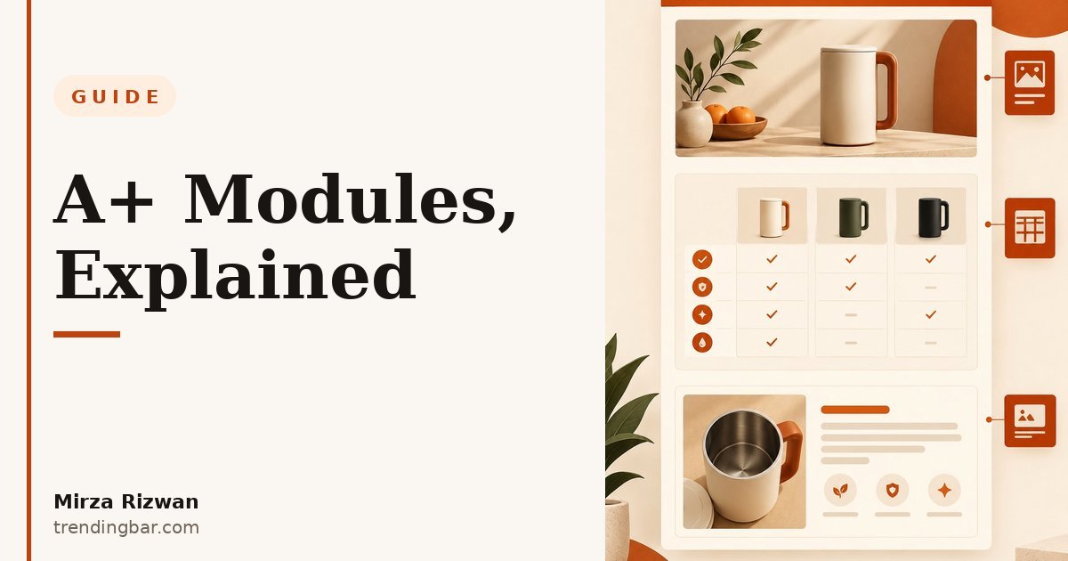
Every few weeks a seller sends me their A+ Content and asks what's wrong with it. I scroll through and see the same disease: all thirteen Basic modules, stacked in default order, like a buffet plate piled with everything. A logo banner. Four tiny lifestyle photos. A text list that repeats the bullets. The page is longer, louder, and somehow says less.
\nHere's the thing nobody tells you: A+ Content is not a canvas, it's a sales pitch with slots. You get five modules in Basic A+, seven in Premium. Each one has a job. When I design A+ for a product, I start by deleting, not adding. What survives is usually five modules. Let me walk you through which ones earn their place and when.
\nWhich A+ modules actually matter?
\nFive modules carry the pitch. Everything else is decoration. The modules Amazon offers in Basic A+ break into three groups: the openers that hook attention, the closers that convert it, and the filler that fills space without filling wallets.
\n| Module | What it shows | When to use it |
|---|---|---|
| Standard Image Header with Text | 970×600 banner, headline + short body | Almost always. This is your hook. |
| Standard Three Images & Text | Three image-plus-text blocks | Benefits tour: three reasons to buy. |
| Standard Single Image & Specs Detail | 300×300 image + spec table | Technical products: dimensions, capacity, compatibility. |
| Standard Single Image & Highlights | 300×300 image + short highlight bullets | Simple products where specs are overkill. |
| Standard Four Image Quadrant | Four 362×362 images with headlines | Multi-feature products, lifestyle proof. |
| Standard Comparison Chart | Up to 6 products, shoppable | Always. The only module with an Add to Cart. |
| Standard Technical Image | Diagram with labelled callouts | Feature-dense products: explain construction. |
| Standard Text List | Plain text bullets | Rarely. Your images should do this job. |
| Brand Story: Brand Showcase | Three tiles + logo | Every brand. Trust, not specs. |
And the stakes are real. Amazon's own data says Basic A+ can lift sales by up to 8%, and well-implemented Premium A+ by up to 20% (sell.amazon.com/tools/a-content). That lift doesn't come from filling slots. It comes from filling the right slots.
\nStart with the banner: your five-second pitch
\nThe Standard Image Header with Text is the first module shoppers see, and most brands waste it on their logo floating over a stock photo. Don't do that. Your banner has one job: answer \"why this product\" in five seconds. One hero image of the product in its best light, one headline naming the main benefit, one or two lines of support copy.
\nI tell clients this: if a shopper reads nothing past the banner, the banner alone should make them scroll. Think of it like the cover of a magazine. Nobody buys a magazine for the table of contents. Treat your banner the same way. I've redesigned banners where the only change was swapping a logo-first layout for a benefit-first one, and the whole page read better instantly.
\nThe comparison chart is the closer
\nThe Standard Comparison Chart is the only A+ module with a shoppable Add to Cart button, and it's the module I will never let a client skip. Why? Because it keeps the shopper inside your catalog. When someone is comparison shopping, you want them comparing your products against your other products, not wandering off to a rival's page.
\nHere's how to run it properly. List three to six of your own products: your budget option, this product (highlighted as the best match), and your premium option. Mark this product as the \"best\" pick in the row. That framing does the selling for you. The chart answers the unspoken question every buyer has: \"should I pay more or less than this?\"
\nOne rule: never compare against products you don't own. That sounds obvious, but I've seen sellers try to be clever about it. Amazon won't approve it, and it isn't your fight anyway.
\nSpecs versus highlights: stop mixing them up
\nTwo modules look similar and get confused constantly: Standard Single Image & Specs Detail and Standard Single Image & Highlights. Pick one. Never both.
\nThe specs module gives you a proper table: dimensions, weight, capacity, material, compatibility, what's in the box. Use it when your product has numbers buyers actually check. A blender. A storage rack. Anything where the wrong size means a return. A spec table kills the \"will it fit?\" anxiety before it becomes a one-star review.
\nThe highlights module gives you short text bullets beside an image. Use it when your product is simple and the selling points are emotional or benefit-led rather than numerical. A scented candle doesn't need a spec table. It needs three sentences about the experience.
\nMy opinion, stated plainly: if your product has real specs and you're using the highlights module instead, you're hiding the information buyers need most. Specs are trust. Hiding them looks like hiding something.
\nThe technical image module: diagram the invisible
\nThe Standard Technical Image module is the most underused one on this list, and it's my favorite for feature-dense products. It lets you show a diagram with labelled callouts: construction layers, part names, how-it-works arrows.
\nWhy does this matter? Because some value is invisible. A layered material, an internal mechanism, a construction method. Photos can't show it, so shoppers can't value it. A labelled diagram can. I use this module on anything with engineering inside: name each layer, each part, each function. Specificity earns trust. A diagram that says \"triple-layer\" without naming the layers is just a prettier photo.
\nBrand Story modules: trust, not specs
\nBrand Story is a separate A+ content type that runs across all your ASINs: your brand's values, mission, and catalog in three tiles plus your logo. Here's the honest take: Brand Story doesn't close sales. It opens wallets for your other products. It answers \"who are these people\" at the exact moment a shopper is deciding whether to trust you.
\nGarden of Life's brand manager Day Tomko put it well: \"A+ Content has helped us build our brand story while helping consumers discover products in our catalog. This has helped us continue to build that trust... and ultimately drive sales.\" That's the function. Trust at the catalog level, so every listing converts a little easier.
\nKeep it short. Three tiles: what the brand stands for, one proof point, one nudge to the catalog. If your Brand Story reads like an About Us page, trim it. Nobody came to your product page to read your founding story. They came to decide.
\nThe five-module stack I'd build for most products
\nIf you forced me to build A+ for a product I'd never seen, knowing only its category, this is the stack I'd start with:
\n- \n
- Banner (Image Header with Text): one benefit, one hero image. \n
- Benefits tour (Three Images & Text): three reasons to buy, each with its own scene. \n
- Specs or highlights: specs for technical products, highlights for simple ones. Never both. \n
- Comparison chart: your catalog, this product marked as the pick. \n
- Brand Story tile: three tiles, trust and catalog discovery. \n
Add the technical image module as a sixth for anything with hidden engineering. That's it. That's the whole playbook. Everything else on the module list is a supporting actor, and supporting actors don't carry films.
\nMistakes I keep seeing
\nThree, and they're everywhere. First: the text-list module used as a second bullet section. Your listing already has bullets. A+ is visual real estate; if a module has no image, it should have a very good reason to exist. Usually it doesn't.
\nSecond: lifestyle photos with no copy telling the shopper what to notice. A woman holding a bag in a park is a mood, not a message. Every image needs a job: show scale, show use, show quality. If you can't name the job, cut the image.
\nThird: treating all five modules as equal. They're not. The banner and the comparison chart do the heavy lifting. If you spend your design budget evenly across five modules, you've starved the two that matter. I've seen sellers with gorgeous quadrant grids and a banner that looks like a PowerPoint title slide. Flip the priorities.
\nFor the full picture on how A+ fits into the whole listing, read my Amazon A+ Content hub, and if you're starting from the top of the page, my guide to designing listing images that convert covers the gallery above it. My 50-listing audit shows what most listings get wrong before A+ even starts. And if you're shopping for help rather than DIY, my buyer's guide to choosing an A+ designer lays out what to ask before you pay.
\nA quick note on who I am: I'm Mirza Rizwan, a designer at trendingbar.com who's spent eight years making Amazon listings sell. A+ is one of the five services I build for sellers: Amazon listing images, A+ Content, storefronts, packaging, and brand graphics. If your A+ feels like a buffet plate, I offer a free audit and I'll tell you which modules to cut, which to keep, and what's missing.