Teardown: How I Designed the Silicone Loaf Pan Listing

Oct 4, 2026 · 8 min read
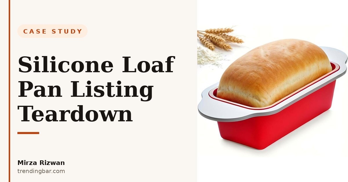
I've got to be honest: silicone bakeware is one of the hardest categories to design for. On a white background, a silicone loaf pan is a red rectangle. There's no lighting trick or camera angle that makes one red rectangle look premium and the other look cheap. Every competitor's pan looks identical, and that sameness is exactly the design problem. When the product photo can't differentiate, the infographics have to.
Boxiki Kitchen came to me with a genuinely better pan: nonstick silicone interior, rigid steel frame built into the walls. But I learned something the hard way over eight years of listing work: buyers don't pay extra for a better product. They pay extra for a better-understood product. The frame is invisible. If your images don't show it, the buyer assumes it's just another floppy silicone pan, and she buys the cheapest one. My whole job on this set was to make the invisible the star.
What's the one thing this listing had to prove?
Before I designed a single frame, I read through the category's reviews, mine and the competitors'. Two pain points kept surfacing. First: silicone pans that collapse or fold in the middle of a bake, especially with heavy batter. Second: loaf pans that won't release the bread cleanly, so the loaf tears coming out of the pan. The product solved both: the frame handles the first, the nonstick interior handles the second. But you can't lead with both at the same volume. One claim per module, or nothing lands.
So the hierarchy went like this. The steel frame got the starring role: a cutaway view showing the frame inside the silicone wall, with the line "helps the loaf pan hold its shape, bake after bake." I like that line because it's a feature and a promise in one frame. It doesn't say "steel frame" and stop. It says what the steel frame does for you, in your oven, repeatedly. That's the difference between a spec and a selling point, and most sellers never make the jump.
The nonstick interior got named first in the infographic sequence, before the frame, even though the frame was the star. Why? Because nonstick release is the feature the buyer is shopping for. Nobody searches for a steel frame. They search for a loaf pan that releases. The nonstick is the hook; the frame is the reason to believe. Order matters more than people think, and this is one of those quiet decisions that separates a designed set from a decorated one.
Why does the hero image say "Upgraded"?
Because this was a second-generation product, and returning buyers were the quiet audience nobody was designing for. The word "Upgraded" on the hero image does the work of a whole paragraph of comparison copy. It tells someone who bought the old version (or just saw it) that this isn't a relist. It's a new generation.
I've seen sellers resist this. They worry "upgraded" sounds like the old one was bad. It doesn't. Buyers read it the way it's meant: same trusted product, now better. One word, zero extra pixels, and it preempts the most common question from repeat customers: "Is this the same one?" Cheap to add, expensive to leave out.
Why do the handles get their own infographic?
This is the call I make that surprises people. The wide, secure grip handles got their own tile instead of being folded into a features list. Here's my reasoning: the handles are the one part of the pan a baker touches every single time she uses it. In and out of a hot oven, that's the moment of truth for a piece of bakeware.
Naming a feature with its own tile tells the buyer you took it seriously. When I squeeze six features into one infographic, the buyer reads that as filler. When I give handles their own frame, the buyer reads it as "they actually thought about this." Attention is a trust signal. Cheap listings spread it thin. Good ones spend it where it counts.
What do most bakeware listings get wrong?
Let me be blunt about the category, because the mistakes repeat everywhere I look:
- Photo galleries with no diagrams. Seven lifestyle shots of bread on a wooden table. Pretty. Tells you nothing about the pan. The product's edge is structural, and not one image shows the structure.
- The temperature spec buried in the bullets. For silicone bakeware, "is it oven safe and how hot?" is the most-asked question. I've watched sellers hide the answer in paragraph four of their A+ content while the infographics talk about color options.
- Feature lists instead of pain answers. "BPA-free, dishwasher safe, freezer safe": fine on paper, but those are table stakes. The buyer with a torn loaf doesn't care about the freezer. She cares about release. The buyer with a collapsed pan doesn't care about color. She cares about the frame. Design for the pain, not the spec sheet.
Why is the oven temperature its own tile?
Oven safe to 450°F (232°C). That spec got isolated as its own tile instead of sitting inside the spec block. The reason is simple: for silicone bakeware, it's the single most-asked question, and the answer doubles as a differentiator. Cheap silicone warps or discolors at high heat. Putting the number front and center answers the question before the buyer has to ask it, and it quietly says "this one can take it."
One small detail worth noting: I included both Fahrenheit and Celsius on the tile. Boxiki Kitchen sells in multiple markets, and a buyer who has to convert the number herself is a buyer who might just bounce. Remove every micro-friction you can find. That habit has served me well across 200+ listing sets.
How does this compare to a typical competitor listing?
| What most sellers show | What we showed instead |
|---|---|
| Hero: pan on white, no headline | Hero: "Upgraded Loaf Pan" headline signaling a new generation |
| Eight features crammed into one image | One claim per infographic: frame, handles, nonstick, temperature each get a tile |
| Steel frame mentioned in bullet six, if at all | Cutaway diagram making the hidden frame visible, framed as a promise |
| Temperature buried in the description | 450°F (232°C) as its own tile answering the top question |
| Lifestyle-only supporting images | Lifestyle plus a spec tile: beauty shots backed by numbers |
What would I change if I rebuilt it today?
One thing, and it's the frame I wish I'd added: a visual stress test. The "holds its shape, bake after bake" line is strong in words, but a single image showing the pan loaded with heavy batter next to a competitor's pan sagging in the middle would make the claim undeniable at a glance. Claims you can see beat claims you can read. That's true in every category I've worked in. The money belt listing worked the same way: the six-layer construction diagram did the job that words couldn't.
Buyers don't pay extra for a better product. They pay extra for a better-understood product. Your images are the understanding.
What's the takeaway for your listing?
If your product's real advantage is hidden (a frame inside silicone, a layer inside fabric, a mechanism inside a housing), your listing images have to diagram it, not just photograph it. Buyers can't value what they can't see, and they won't read three paragraphs to learn what your main image should have told them in two seconds.
And name things. "Reinforced durability" is fine, but "helps the loaf pan hold its shape, bake after bake" is a promise a buyer can picture in her own kitchen. Specificity is what separates a listing that converts from a listing that just exists. I say that in nearly every audit I do, because it's the mistake I see most: vague claims where a concrete one would have cost nothing extra.
If your Amazon listing images are just photos with your logo on them, you're leaving the sale to chance. That mindset — images as salespeople, not art — drove every design call in this teardown. I design Amazon listing images that do the actual selling, and I offer a free audit where I'll look at your current listing and tell you exactly which advantage your images are hiding. No pitch, just the audit. You can also browse the full set in my portfolio, or read more about how I work.