Your Listing Images Are Not Art. They're Salespeople.

Oct 7, 2026 · 8 min read
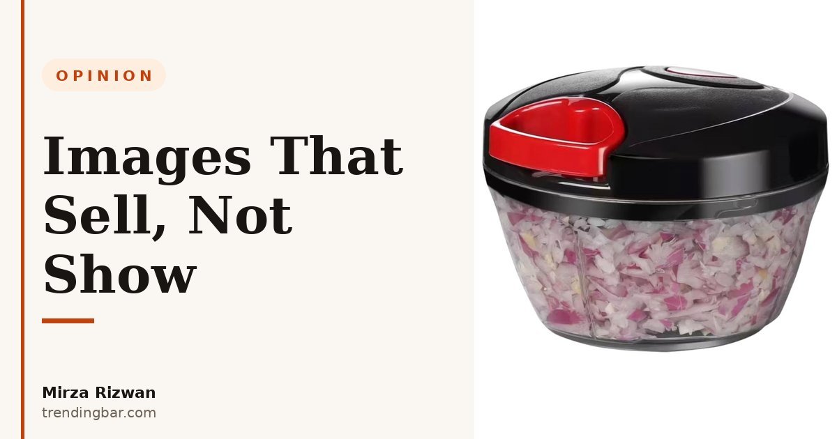
I've been designing Amazon listing images for 8 years, and I keep seeing the same mistake. A seller shows me a clean, pretty set. White background, nice light, product centered. It looks like a portfolio piece. Then I ask one question: what's image 3 supposed to make the buyer do?
Silence. That's the tell. Pretty isn't a job description. A salesperson has a job — handle an objection, prove a claim, close the next click. Your images need the same brief, or they're just filling slots.
I'm Mirza Rizwan — I run trendingbar.com and I spend my weeks turning listing images into little sales arguments. Here's how I think about it, and how you should too.
Why do pretty images lose sales?
Pretty images lose because they answer no question. A shopper doesn't buy polish; they buy certainty that this product fits their hand, their counter, their problem. If your image could sit on any competitor's listing without looking wrong, it's not selling yours.
I learned this the hard way. Early on, I chased clean. Minimal backgrounds, soft shadows, lots of negative space. Clients loved how it looked. Sales didn't move. The images that moved sales were uglier on purpose , a hand for scale, a callout naming a real number, a before-and-after that showed the mess the product fixes. They weren't art. They were arguments.
There's a reason Amazon's own main-image rules push you this way. The product has to fill at least 85% of the frame on pure white (RGB 255, 255, 255). That's not an aesthetic rule. That's a thumbnail rule. At search-result size, white space is wasted selling space. Amazon isn't asking for art. It's asking for legibility.
A salesperson who can't explain the product in 3 seconds gets walked past. So does an image.
What does a salesperson image actually do?
Each image has one job, and you should be able to say it in one sentence. Image 1 earns the click. Image 2 proves the headline claim. Image 3 kills the biggest objection. The rest handle size, use, trust, and what's in the box , in that order of doubt.
Here's the test I use on every set I design. Cover the product name. Read only the images, in order, like a stranger on a phone. Do you know what it is, why it's better, whether it'll fit, and what could go wrong? If any answer is "maybe," that slot is decorating, not selling.
- Earn the click (image 1): compliant, big in frame, instantly readable at thumbnail size. No props that confuse what's included. I cover the full rules in my 2026 main-image compliance checklist.
- Prove the claim (image 2): one claim, one visual proof. Not 12 features in tiny text. If the claim is capacity, show it full. If it's speed, show the result.
- Kill the objection (image 3): the thing buyers return products over. Size, fit, compatibility, effort. Show it next to a hand, a ruler, a standard object. This is where most sets are weakest , I break down why in what top kitchen listings get right with their early slots.
- Show it in life (image 4-5): the product mid-task, in a real setting, with a result visible. Not a mood photo. Evidence.
- Remove risk (image 6-7): what's included, dimensions in both inches and cm, care or compatibility. Boring? Yes. And it's the slot that stops returns.
Notice what's missing from that list: "show the brand story." Brand matters, but it matters after the buyer believes the product works. Story is the close, not the opener. My full slot-by-slot system sits inside my start-here guide to Amazon listing images if you want the longer version.
Art mindset vs salesperson mindset , which one is on your listing?
The salesperson mindset wins because it starts from the buyer's doubt, not the designer's taste. Same product, same camera, completely different brief. Here's the split I see in almost every audit:
| Decision | Art mindset | Salesperson mindset |
|---|---|---|
| Image 2 | Clean lifestyle shot, product small in a nice kitchen | Product mid-task, one benefit overlay a phone can read |
| Text on image | Avoided , "it looks cluttered" | One short claim per image, large type, tested at thumbnail size |
| Scale | Implied, artistic angle | Hand, ruler, or common object in frame , no guessing |
| Order | Prettiest first | Biggest doubt first, beauty later |
| Success metric | Looks good in the portfolio | Click-through, conversion, fewer "wrong size" returns |
I'm not anti-beauty. A sloppy image kills trust fast. But beauty is the uniform, not the performance. A salesperson in a great suit who can't answer questions still loses the sale. Your images work the same way.
What do Amazon's numbers say about images that sell?
Amazon's guidance points the same direction: more proof, more clearly. Seller Central recommends at least six images and one video per product, and images over 1,000 pixels on the longest side to switch on zoom. Zoom isn't a vanity feature. It's the buyer leaning in to inspect , the digital version of picking the product up. Amazon puts it plainly: "we recommend you provide six images" and larger images because zoom "has been shown to enhance sales."
The same pattern shows up below the fold. Amazon reports Basic A+ Content can lift sales by up to 8%, and Premium A+ by up to 20%. I've seen sellers read that as "add more branding." Wrong lesson. The lift comes from modules that compare, demonstrate, and answer , the salesperson work, moved further down the page. A+ that repeats your image claims in larger fonts wastes the slot.
And here's the newer catch most sellers miss. Sellers don't fully control image metadata anymore; Amazon increasingly describes images with its own systems. That makes unambiguous images even more important. One clear scene with one short benefit overlay reads correctly to the shopper, to Google, and to Amazon's own tools at the same time. A clever, text-free art shot reads correctly to nobody but the designer. I dig into the practical side of that shift in my 2026 guide to listing images that convert.
How do I brief every image like a sales call?
Start each slot with the objection it has to handle, then design backwards. Before I open Photoshop, I write one line per image: "This image exists so the buyer stops worrying about ___." If I can't fill the blank, the slot gets redesigned or cut.
Steal my pre-upload checklist. It takes 10 minutes and it catches most of the expensive mistakes:
- Thumbnail test: shrink image 1 to search-result size. Can you name the product in 1 second? If not, enlarge the product and cut props.
- One-claim test: point at each secondary image and say its claim out loud. Two claims? Split it or delete the weaker one.
- Scale test: is there a hand, ruler, or known object anywhere a buyer judges size? Guessing causes returns.
- Phone test: view the full set on your phone, outside, screen dimmed. That's where your buyer lives. If the text needs a zoom pinch, it's too small.
- Swap test: could a competitor paste their logo on your image and use it? If yes, you photographed the category, not your advantage.
One more thing, and sellers push back on this constantly: don't put 12 features on image 2. I've never seen a buyer read them. I have seen buyers leave. One proof beats twelve promises, every time. If you take nothing else from this post, take that.
When should you fire your current image set?
Fire it when it can't answer for itself. If you can't assign each image a job, if your conversion is stuck while traffic grows, or if your returns mention size and expectations , your images are decorating. Traffic problems live in search. Conversion problems live in the image stack.
Don't redesign everything at once, either. Change image 1 for compliance and scale first, then image 3 for the top objection, then measure. Sellers who rebuild all 7 slots overnight learn nothing about what worked. Sellers who brief each slot like a hire they have to justify end up with a set that sells while they sleep.
So here's my question for you: if your images stopped being art tomorrow and had to earn commission instead, which slot gets fired first? Start there.
That's the standard I design to on every project. You can see the broader approach across the services I offer and recent work , but honestly, the fastest way to see it is on your own listing. I offer a free audit where I'll mark each of your images keep, fix, or fire, and tell you which objection each one should be handling. By , Mirza Rizwan, trendingbar.com.