5 Signs You Need a Packaging Redesign (With Examples)

Oct 21, 2026 · 10 min read
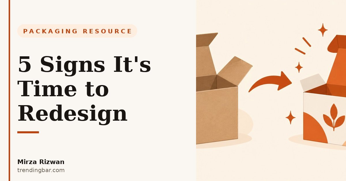
I can usually spot a dying pack in about ten seconds. That's not a superpower. It's just that the same failures repeat. After years of designing and auditing packaging, I've learned that bad packs don't fail in mysterious ways. They fail in the same five ways, and almost every one of them is fixable before it costs you real money.
There's an old packaging-world phrase for what's at stake: the pack is the "silent salesman." The term goes back to marketer James Pilditch's 1961 book, The Silent Salesman. It is still the best job description packaging has ever had. Your pack is out there closing sales while you sleep. When it stops closing, that's your redesign signal.
Here are the five signs, each with a real-world example of what it looks like. Be honest with yourself as you read.
1. Shoppers can't tell what it is: the 3-second test
Here's the blunt version: if a shopper can't name the product and its one main benefit within three seconds of seeing the front panel, the packaging has failed at its most basic job.
I run a simple test on every pack I audit. I show the front panel to someone who has never seen the product and ask two questions: what is this, and why would I buy it? Half the time they guess wrong. The brand guessed right, of course. The brand knows what it is. But the brand isn't the one standing in the aisle (or scrolling) with seven competitors next to it.
Example: I saw a protein bar at a trade show last year where the front panel led with a big lifestyle photo and the brand logo. The actual flavor was printed in small type, curved along the bottom. From three feet away it was a handsome beige box. From three feet away it could also have been granola, cookies, or dog treats. The brand was proud of the design. The design was beautiful. And the design was not selling protein bars.
This is the most common failure I see, and it's the cheapest to diagnose. Show your front panel to three strangers this week. If they hesitate, you've found your sign.
2. Your price and your pack are telling different stories
Buyers decide what your product should cost before they read a single word. The pack sets the price expectation, and if the pack undersells the product, you lose margin. If it oversells the product, you lose trust.
An Ipsos poll conducted for the Paper and Packaging Board found that 67% of shoppers say packaging materials often influence their decision to purchase. A Dotcom Distribution survey found 61% of people are more likely to buy a luxury product again if it arrives in premium-looking packaging. In other words, the pack is part of the product. Treat it like decoration and it leaks money.
Example: I once audited a skincare brand selling a $40 serum in a pack that screamed $12 drugstore. Thin card, generic stock imagery, no weight to the box. The product inside was genuinely good (reviews said so). But the unboxing told a $12 story, and customers felt overcharged. On the flip side, I've seen budget granola in matte-finish boxes with gold foil that set expectations the $4 product couldn't survive. Both directions hurt. (I've written more about the second trap in my post on why a luxury look can backfire on a budget brand.)
The fix isn't "make it fancier." The fix is making the pack and the price tell the same story. That's a design decision, not a budget decision.
3. Your front panel has no hierarchy: everything shouts
The front panel has one job: establish the visual hierarchy. One hero message, one supporting message, and everything else stays quiet. When every badge, claim, and logo is the same size, nothing is the hero. Shoppers read nothing.
This is the failure I see most often on otherwise decent brands. They earned certifications, won awards, sourced organic ingredients, and they put all of it on the front at the same visual volume. "Organic. Vegan. Gluten-free. Family-owned. Award-winning. New formula." Six badges, zero focus. The brand tried to say everything and communicated nothing.
Example: a snack pouch I reviewed had fourteen separate claims on the front. Fourteen. The product name was the fifth thing my eyes landed on. We cut it to three: product, one benefit, one proof. The rest moved the rest to the back panel and the website. Same information. Completely different pack. Your packaging only has seconds to sell, and hierarchy is how you spend them.
A quick rule I use: squint at your front panel. Whatever you can still read while squinting is your hierarchy. If that's not the product and its promise, redesign the panel.
4. It was designed for a shelf, but you sell on a screen (or the reverse)
Design for the place where your pack is seen first. If that place changed, your pack is outdated even if the design itself is fine.
Retail packaging lives at arm's length. The front panel matters, but so do the sides, the back, the hang tab, the way it catches store lighting. Online, none of that exists. Your listing shows the front panel as a thumbnail the size of a postage stamp, and that's the whole pitch. A pack designed for retail shelves can be invisible online: tiny type, detail that dies at 200 pixels, a front panel that assumed a shopper could pick it up and turn it around.
Example: a tea brand I came across had a gorgeous retail box with beautiful side panels with the brand story, brewing instructions, origin details. Online, it was a disaster. Their Amazon sales had grown to most of their revenue, and the listing thumbnails showed a box whose front panel was mostly a pattern. The pattern was lovely. The pattern did not say "chamomile." Their best retail pack was their worst online pack.
The reverse happens too: a pretty mailer box that photographs beautifully for unboxing videos but collapses in transit or fails warehouse requirements. Before you redesign, write down where your pack is actually seen first today. Not five years ago. Today. If the answer changed, so must the design.
5. The materials and the rules moved on without you
Packaging isn't just a design object anymore. It's a compliance object. And the compliance timeline is no longer theoretical.
The EU's Packaging and Packaging Waste Regulation (Regulation (EU) 2025/40) entered into force on 11 February 2025 and generally applies from 12 August 2026, with design-for-recycling grades and recycled-content minimums phasing in toward 2030 (Mondaq's PPWR overview). If you sell into the EU, this isn't a design trend. It's law with dates attached. A redesign that ignores it will be outdated before it's printed.
And even where law doesn't force the issue, shoppers are moving. That same Ipsos poll found paper and cardboard packaging makes a product look premium to a majority of shoppers. Materials talk. What your pack is made of is part of what it says.
Example: a cosmetics seller shipping to Europe was using multi-material blister packs: plastic, card, and foil bonded together. Looked fine. Felt fine. Under design-for-recycling grading, that construction scores badly, because bonded mixed materials are hard to recycle. Their redesign wasn't about looks at all. It was about switching to a mono-material structure their current printer could run. Same shelf presence, completely different compliance profile.
If you sell into the EU and haven't reviewed your pack against the PPWR timeline, put that on your redesign checklist now. And while you're at it, check the packaging dieline basics. Most structural problems start in the dieline, not the artwork.
Before you redesign: the honesty checklist
Two or more of these is your answer. Run through them in ten minutes.
| Sign | The 10-second self-test |
|---|---|
| Unclear product | Show the front panel to a stranger. Can they name the product and its benefit? |
| Price-pack mismatch | Cover the price. Ask someone what they'd expect to pay. Close? |
| No hierarchy | Squint at the front panel. Is the product and promise the last thing readable? |
| Wrong channel | Where is your pack seen first today: shelf or thumbnail? Was it designed for that? |
| Outdated materials/rules | Do you sell into the EU? Does your structure meet design-for-recycling direction? |
A word of caution: redesigns can backfire
Here's the part designers don't like saying: a bad redesign can cost you more than no redesign. According to WestRock's research, 52% of consumers have switched brands because of a packaging redesign. People are attached to the visual codes they know: your color, your logo lockup, your shape. Change everything at once and loyal buyers walk past you.
So the move is evolution, not revolution. Keep your brand codes. Fix the hierarchy, the channel fit, the structure. Test the new front panel against the old one with real shoppers before you print ten thousand units. A redesign is a sales tool, and sales tools get tested.
What a redesign fixes — and what it doesn't
A good redesign fixes hierarchy, channel fit, price alignment, and compliance. It makes the silent salesman louder and clearer. What it doesn't fix: a weak product, no traffic, or bad reviews. I've seen sellers redesign a pack three times while their review rating sat at 3.2 stars. The pack wasn't the problem. The product was.
Be honest about which problem you have. If the product sells fine but the pack confuses people, undersells the price, or breaks a rule, redesign. If nothing sells, fix the product first. Design is a multiplier. Zero times anything is zero.
FAQs
How often should I redesign my packaging?
There is no fixed cadence, and anyone selling you a "redesign every two years" rule is selling you design services. Review your pack against the five signs once a year. If you sell into the EU, the PPWR timeline gives you hard external deadlines anyway. Treat those as your review schedule.
Will a redesign confuse my existing customers?
It can — half of shoppers have switched brands over a redesign they disliked. The safeguard is keeping your recognizable brand codes (color, logo, shape) while fixing the hierarchy and structure underneath. Evolve the pack; don't replace the brand.
How much does a packaging redesign cost?
It depends on structure complexity, print process, SKU count, and whether the dieline changes. What drives the price up is indecision: brands that can't pick a direction pay for rounds of revisions. I've broken down what packaging design typically costs so you can budget before you brief anyone. And if you want a second pair of eyes first, my packaging design hub covers the full process.
If two or more signs on that checklist hit home, don't guess your way through it. I design packaging that sells. You can see the range of my packaging work, and I offer a free packaging audit where I'll run your current pack through the five signs and tell you exactly what's failing, within 48 hours.