Packaging Design: The Start-Here Guide

Oct 5, 2026 · 5 min read
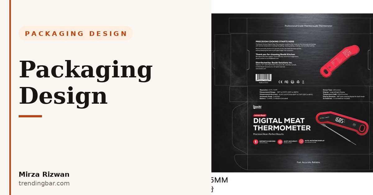
Here's the thing most sellers get wrong: they treat packaging as a cost and the listing as marketing. I've spent 8 years doing both, and I can tell you the box is marketing. It's the first physical thing your customer touches. It shows up in your listing photos. It shows up in review photos. A box that looks like an afterthought makes buyers wonder what else you skimped on.
What I actually do
My process is boring in the best way. It goes like this.
First, the dieline. I get the structural dieline from your manufacturer before I design a single pixel. If the dieline doesn't exist yet, I work with the manufacturer to build one. Design never starts on guessed dimensions, because a box designed for the wrong fold lines is just an expensive illustration.
Second, the hierarchy. I decide what must be readable at thumbnail size: brand, product name, one benefit. That's it. Everything else is support. Most packaging fails here because the designer tried to fit the whole website on a four-inch box. You can't read it on screen, and you definitely can't read it inside a listing image.
Third, print reality. I build everything in CMYK with real bleed, outlined fonts, and finishes matched to the material. I learned this the hard way early in my career: a design that looked rich on my screen washed out on kraft board, and a missing 3mm bleed left a white hairline on every box in the run. Now I proof for the substrate, not the screen. Matte lamination, spot UV, kraft, corrugated: each one drinks color differently, and your design has to account for it. My tools are Illustrator for the vector dieline work and Photoshop for mockups and presentation renders, and I keep the two honest with each other.
Fourth, the listing. This is where my Amazon background pays off. I design the packaging knowing exactly how it will photograph: the front panel becomes your "what's in the box" image, the interior print becomes your unboxing moment, the seal becomes your trust cue. Plenty of packaging designers hand you a box and walk away. I think about your main image while I'm placing your logo.
A quick opinion, since you came for a guide: you'll hear "minimalist premium packaging" as default advice. I disagree. Minimalism only works when your brand is already known. For a new brand, a plain box doesn't read premium, it reads blank. What reads premium is intention: consistent type, real hierarchy, one finish done well. Don't copy Apple until you've earned the recognition that lets Apple get away with it.
The mistakes I see most
I've reviewed a lot of packaging across 500+ projects, first as Senior Amazon Visual Strategist & Packaging Designer at Packifyme and now as a freelancer. The same five mistakes keep showing up.
1. Designing for a shelf that doesn't exist. Your product will be judged in a thumbnail, not picked up in a store. Yet sellers obsess over side-panel copy nobody will ever read. I design the front panel first, at actual listing-image size, and only then fill in the rest. If the box doesn't sell at 800 pixels wide, the pretty side panels don't matter.
2. Type you can't read at small size. Thin script fonts, dark text on darker backgrounds, the product name shrunk to fit because the legal text needed room. On Amazon, the box often appears in the main image or the package-contents photo. If a buyer can't read it, the photo adds nothing. Test every panel at thumbnail size. If it fails there, redesign it.
3. No unboxing moment. Cheap brands ship in a blank mailer. The brands customers photograph add one thing: a printed interior, a sleeve, a thank-you card with the brand on it. That single addition costs little per unit and buys you review photos, social posts, and repeat buyers. Unboxing is free advertising, and most sellers leave it on the table.
4. Ignoring print specs. RGB files sent to a CMYK printer. No bleed. Fonts left live so the printer substitutes them. These are not minor details; this is how you end up with a full print run of boxes you can't use. Every file I deliver is print-ready: CMYK, correct bleed, outlined type, proofs matched to the actual material. Ask your printer what they need before you approve anything.
5. Packaging that contradicts the listing. A premium minimalist listing next to a loud coupon-style box, or vice versa. Buyers feel the mismatch even if they can't name it, and it erodes trust in both. Your packaging and your listing are the same brand speaking twice. They should agree.
Where to start
If you're an Amazon seller, start with my teardown of the silicone loaf pan listing: how I designed the silicone loaf pan listing for Boxiki. It isn't strictly about packaging, but it shows the physical-product thinking behind every project I take on: what the buyer holds, what the box communicates, and how the images close the gap between the two.
Then look at the real work. I have five packaging case studies in my portfolio, real boxes that went to real printers, including work from the Boxiki family of brands and my time at Packifyme. No mockup-only concepts, no student work. If you want packaging that prints right, look at packaging that already did.
And if you're scoping a project, my services page lays out exactly what a packaging engagement covers: dieline to print-ready files, plus the listing assets your box feeds into.
One last thing. If you're reworking your packaging or launching a new product, I offer a free packaging audit: send me your current box, your dieline, or even just a product photo, and I'll tell you what's costing you sales before it goes to print.