How to Design Amazon Listing Images That Actually Convert

Oct 4, 2026 · 9 min read
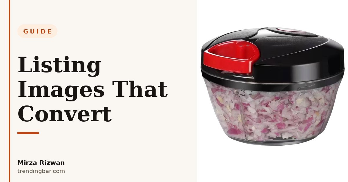
Let me be blunt: most listings I get asked to redesign don't have a photography problem. They have a thinking problem. Seven images that all say the same thing: "here's the product." The buyer needed answers, and nobody gave them any.
I've spent eight years designing Amazon listings on Upwork. Home & Kitchen, Beauty, Supplements, Electronics, Apparel, Pet, Lifestyle. 500+ projects across all of them, Rising Talent badge, 100% Job Success. And the pattern never changes: the listings that convert aren't the prettiest ones. They're the ones where every single image has a job. You can see the approach in my recent work here, and I'll walk you through the whole system below.
What's the real job of your listing images?
Your images are the sales pitch. Most of your traffic is on a phone, and on a phone nobody reads your bullet points first. They swipe through the images and decide in about ten seconds whether this product deserves a closer look. If the images don't carry the argument on their own, the listing is dead before the bullets ever get read.
So I tell every client the same thing: your image stack has to sell the product without a single word of your listing copy. If it can't, no amount of keyword stuffing in the bullets will save it. One image, one question answered, in the order the buyer actually asks them. That's the whole system. Everything else is decoration — which is exactly why I say listing images should be hired like salespeople, not hung like art.
Why does the main image matter more than everything else combined?
Because the main image is the only image that competes. It sits in the search results at thumbnail size next to a dozen competitors, and its entire job is the click. Nothing else. Not the features, not the story. Just stop the thumb.
Amazon's rules for the main image are strict, and they're strict for a reason:
- Pure white background: RGB 255, 255, 255, per Amazon's terms. Not off-white, not light grey.
- Product fills 85% or more of the frame. Tiny product floating in white space loses to a big one every time.
- No text, logos, or borders on the main image for most categories. Save the headlines for slot two.
- 2000 pixels or more on the longest side so zoom actually works (1000px is the minimum, but zoom is where buyers inspect quality, so give it to them).
- sRGB JPEG. Sounds technical, sounds boring. Get it wrong and your colors shift on some screens.
Now here's where I'll disagree with a lot of design advice floating around: some sellers swear by lifestyle main images: a styled scene instead of the white background. I've seen this trend come and go twice. It only works when your brand is already famous enough that buyers recognize the product in a busy scene. For everyone else, the plain white shot wins the click, because the buyer's eye finds your product in a fraction of a second. Don't get clever with the one image that decides whether anyone clicks at all.
How should I plan the rest of the image slots?
Amazon gives you six primary image slots (up to nine in some categories). Here's the arc I use on nearly every project. It works for a silicone loaf pan and a supplement bottle alike, because it follows the buyer's brain, not the product category.
Slot 2 states the promise. One headline, one benefit, big and readable on a phone. Not five bullet points crammed onto an image. One. Slot 3 shows what's hidden: the inside, the mechanism, the thing the photo can't show. When I redesigned the listing for Boxiki Kitchen's silicone loaf pan, the whole project hinged on this slot: the pan has a steel frame hidden inside the silicone rim, and nobody was buying a premium-priced pan until the images diagrammed it. I tore that whole process down in this teardown.
Slot 4 sets the scale. A hand holding the product, or the product next to something everyone knows the size of. This is the slot most sellers skip, and it's the one that prevents the "smaller than I expected" one-star reviews. Slot 5 answers objections: feature callouts, how to use it, what's in the box. Keep the text short. If it needs a paragraph, it doesn't belong on an image.
Then slots 6 and 7 close. A comparison against the cheap alternative (not naming names), just showing the difference side by side. And a lifestyle shot: the product in a real kitchen, a real bathroom, a real hand. Lifestyle belongs here, at the end, doing the emotional close. Not at the front, competing for the click.
| Slot | Its job | What goes in it | What I usually delete |
|---|---|---|---|
| 1 | Win the click | Product on pure white, 85%+ of frame | Lifestyle mains, text overlays |
| 2 | State the promise | One hero benefit, one headline | Five bullet points crammed on one image |
| 3 | Show what's hidden | Cutaway or diagram of the inside | Generic "premium quality" badges |
| 4 | Set the scale | Hand or familiar object for size | Floating product with no size reference |
| 5 | Answer objections | Feature callouts, what's in the box | Walls of text nobody reads on mobile |
| 6–7 | Prove it | Comparison, lifestyle, packaging | Repeated angles of the same shot |
What mistakes do I keep seeing?
Text-heavy images. This is the big one. Designers (and sellers doing it themselves) write paragraphs on the images, and on a phone it's all unreadable grey mush. If a buyer has to pinch-zoom your infographic to read it, you've already lost them. Short labels. Big type. That's it.
Second: inconsistent design across the slots. Different fonts, different color schemes, one slot that looks like it came from a different brand entirely. Buyers notice sloppiness, even if they can't name it. Sloppiness reads as "this seller might be sloppy with my order too." I learned this the hard way early on, when a client asked why their listing felt "off" and it took me an embarrassingly long time to realize three of their seven images used three different blues.
Third: hiding the boring-but-decisive details. Dimensions. What's actually in the box. How many pieces. The stuff nobody wants to design is exactly the stuff buyers zoom in looking for. Put it in slot 5 and make it impossible to miss.
Is A+ Content actually worth the effort?
Yes. But only after the main image stack is right. I see sellers pour weeks into A+ modules while their main image is a grey-background afterthought. That's backwards. A+ Content is a multiplier, not a rescue. It only shows up after the click, and the click comes from the image stack.
Once the stack is solid, A+ is worth it for one reason: it lets you tell the story the image slots don't have room for. Keep it simple. A comparison chart module (you vs. the generic alternative), a short brand story, and one module that goes deeper on the single feature that justifies your price. Three to four modules, done well, beat eight modules of filler. You need Brand Registry to publish A+ Content, so if you're not enrolled yet, that's step one. The enrollment itself is free.
How do I know the images are actually working?
Two numbers, and I'll be honest about what they can and can't tell you. Click-through rate from search tells you whether the main image is winning the click. If you're brand registered, Brand Analytics and Search Query Performance will show you the number. Unit session percentage (orders divided by sessions) tells you whether the rest of the stack is closing.
What I won't do is promise you a number. Any designer who guarantees a conversion rate is guessing, and I'd rather lose the project than lie about it. What I can promise is the process: fix the stack, run it for a few weeks, and if you're brand registered, use Amazon's Manage Your Experiments to A/B test the main image properly. That's how you find out what actually works instead of arguing about taste.
FAQs
What are Amazon's main image requirements?
Pure white background (RGB 255, 255, 255), product filling 85% or more of the frame, no text or logos for most categories, sRGB JPEG, and at least 1000 pixels on the longest side. 2000px or more if you want zoom to work properly.
How many images should an Amazon listing have?
Fill every slot Amazon gives you: six primary slots, up to nine in some categories. Each one answers a single buyer question in order: the promise, what's hidden inside, the scale, the features, the comparison, the lifestyle proof. An empty slot is a question you chose not to answer.
Do lifestyle images convert better than white-background shots?
For the main image, no. In my experience the white-background shot wins the click in search results for almost every product I've worked on. Save lifestyle shots for the last slots, where they do the emotional close instead of competing for attention at thumbnail size.
That's the system. One image, one job, in buyer order. Plus the discipline to delete anything that doesn't earn its slot. I've applied it across eight years of client work, from kitchen tools to supplements, and it holds up because it's built on how buyers actually shop, not how designers wish they shopped.
Want me to look at your listing? I design Amazon listing images and A+ Content for a living, and I offer a free audit: send me your ASIN and I'll tell you exactly which images aren't doing their job, within 48 hours.