Teardown: Wedding Welcome Sign Listings — Design Breakdown

Oct 26, 2026 · 13 min read
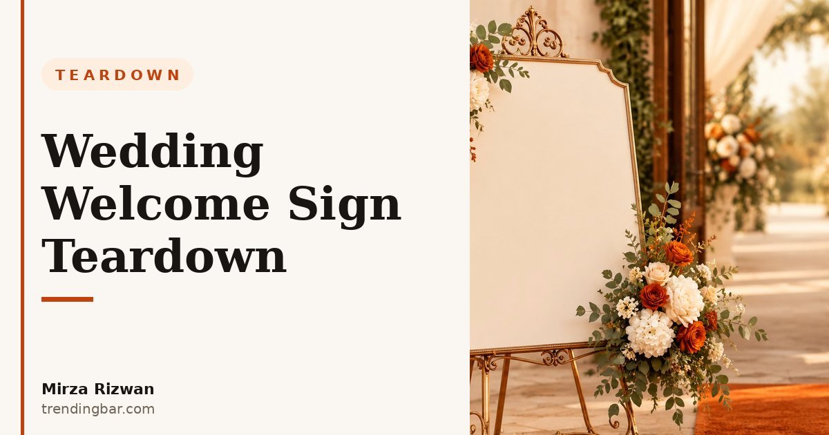
I've looked at a lot of wedding welcome sign listings over the years, and I keep seeing the same opening move: a beautiful sign, shot straight on, floating on white. It looks lovely. It also tells the buyer almost nothing they actually need to know. Will it look lost next to a barn door? Can grandma read it from the path? Does the gold paint look cheap in daylight? A straight-on beauty shot answers none of that.
Here's the thing most sellers miss. A welcome sign is not bought like a lamp or a spatula. Nobody needs one. It is bought for one day, for one entrance, and it has to work in front of real people who are walking, talking, and holding drinks. That is a completely different design problem than "make it pretty." And the listings that win in this category are the ones that show the sign doing its job, not just sitting there looking nice.
Why do most welcome sign listings lose the order before image 2?
The short answer is that they show the product and hide the purchase decision. A buyer choosing a welcome sign has three worries, and they have them in this order: will it fit my venue, will guests actually read it, and will the personalization look right? Most listings answer none of those in the first two images. They show a close-up of the lettering, then another close-up of the lettering from a slightly different angle.
I learned this the hard way when a listing I worked on early in my career led with detail shots. The sign was gorgeous up close. Sales were flat. When we moved a real-venue shot to image 2, showing the sign on an easel beside a doorway with a person standing next to it for scale, the questions in messages changed overnight. People stopped asking "how big is it really?" and started asking about fonts and colors. That is the difference between a listing that creates doubt and one that removes it.
The context matters more here than in almost any category I work in. The Knot's Real Weddings Study puts the average US wedding cost in 2024 at $33,000. At that spend level, a welcome sign is a tiny line item, but it sits at the entrance where every guest forms a first impression. Buyers are not price-shopping a sign the way they price-shop a phone case. They are protecting a first impression. Your images should act like it.
What actually sells a welcome sign? It is not the sign itself
What sells it is proof of the finished moment. A buyer cannot picture their own names on a blank board, no matter how good their imagination is. They need to see a name, in a real font, on a real material, in real light. That is why the strongest listings in this category show a fully personalized example early, not a blank template with "Your Names Here" floating in the middle.
Now, I know the objection. "But every order is different, so a sample name misleads buyers." No, it does not, as long as you are honest about what the sample is. Label it as an example. Show two or three font styles on the same material so buyers see range, not just one look. And show the proof step: a simple image that says you send a preview before production. That one image does more for trust than a paragraph of promises in the bullet points ever will.
One mistake I see constantly: sellers show the sign in a studio and never in a venue. A white background shot is required for your main image on Amazon, and I will get to that, but your second and third images are where the sale happens. An easel shot at a venue entrance, a close shot of the lettering catching light, and a shot of the back or the stand so buyers know how it stands up. Those three shots answer the real questions. A fourth close-up of the same lettering does not.
What about the scale shot most listings skip?
The scale shot is the single most valuable image in this category, and it is the one most listings skip. A welcome sign is a large, flat object. On a screen, a 24-inch sign and a 36-inch sign look identical. Buyers know this, and it makes them nervous. So they message you, or worse, they just leave.
Fix it with one image: the sign on its easel, next to a doorway, with a person standing beside it. No measuring tape stretched across the front, no ruler graphic covering the design. A person gives instant scale in a way numbers never do. Put the actual dimensions in the same image, small and clean, in a corner: width, height, and material thickness. That pairing, human scale plus real numbers, kills the most common pre-purchase question in this category.
I have seen listings where the only size reference is a bullet point that says "large size available." That is not a size. That is a wish. If a buyer has to guess, they will guess wrong, and a wrong guess becomes a return or a bad review. Show the size. It costs you one image slot and saves you a dozen messages.
Can guests actually read it from across the room?
Readability is where pretty signs go to die. A thin script font in pale gold on clear acrylic can look stunning in a close-up and completely vanish from ten feet away in a bright venue. The buyer will not discover this at their wedding. They will discover it in your images, if you let them, or they will discover it too late, if you do not.
So show readability honestly. One image should show the sign from guest distance, not photographer distance. Step back. Let the buyer see what arriving guests actually see. If a font option is delicate, say so by showing it at distance next to a bolder option, and let the buyer choose with open eyes. That honesty sounds risky. It is not. Buyers trust sellers who show the trade-off far more than sellers who hide it behind a macro shot.
Contrast is the quiet killer here. Dark lettering on dark wood, white on frosted acrylic in a bright room, gold on mirrored acrylic under venue lights: all of these can look great in a studio and fail in a sunlit entrance. Show the sign in daylight and in warm indoor light if you can. Two lighting conditions in two images tell a buyer more than any claim about "premium quality" ever could. And please, stop writing "premium quality" on the image. Show me the edge finish, the thickness, the way light hits it. That is what premium looks like.
How should the image order work for this category?
Image order is a sales argument, and for welcome signs the argument should go like this: here it is, here is how big it is, here is how it reads, here is how yours will look. Most listings I review run the argument backwards: detail, detail, lifestyle, and then, somewhere near image 6, a lonely scale shot nobody reaches.
| Slot | What most listings show | What I would show instead |
|---|---|---|
| 1 (main) | Straight-on sign on white | Straight-on sign on white, fully personalized example, no text overlays |
| 2 | Another close-up of lettering | Venue entrance shot: sign on easel, person beside it for scale |
| 3 | A flat lay of the sign | Guest-distance readability shot, plus dimensions in the corner |
| 4 | A different color option, tiny | Font and color options side by side on the same material |
| 5 | Packaging | Proof preview step and stand/back detail: how it stands, how it ships |
Notice what the main image still has to do. On Amazon, the rules are not suggestions. Amazon's product image requirements call for a pure white background (RGB 255, 255, 255), the product filling 85% or more of the frame, and at least 1,000 pixels on the longest side so zoom works. A welcome sign main image can meet all of that and still look like a real product: fill the frame, show the whole sign, no text badges, no props that are not included. The easel, by the way, counts as a prop question. If the easel is not included, do not make it look included. Say so in the image or the title. Small honesty, big trust.
This is also where your main image is an ad, not a photo. It has one job in search results: earn the click from a buyer scrolling past a dozen similar signs. A personalized example with strong contrast earns that click. A blank board does not, because a blank board looks like every other blank board.
How do you show personalization without breaking trust?
Personalization is the whole product here, and it is also where trust breaks. Buyers worry about three things: will my names be spelled right, will the font I picked look like the preview, and will it arrive in time? Your images can answer all three before a buyer ever reads a bullet.
First, show a real-looking example name, not "John and Jane" in a default font. Use a name that looks like a real couple's names, in the font you are actually selling, with the date line and the welcome line laid out the way a real order looks. Second, show the proof step as an image: a simple graphic that says you send a preview and wait for approval before making the sign. Third, show the font and color choices as a comparison, not as six separate listings or six tiny thumbnails. One image, three fonts, same names, same material. That is a comparison a buyer can actually use.
And here is an opinion I will not soften: if your listing shows only blank signs, you are asking buyers to do your selling for you. They have to imagine the finished product, imagine the font, imagine the size, and then trust you with a one-day event. Most will not do all four. Show the finished thing. It is your job, not theirs.
Amazon Seller Central's product image guide puts it plainly: "Professional and compliant product images are essential for marketplace success." In this category, compliant is the easy part. Professional means showing the sign the way guests will actually see it.
The same logic applies to material choices. Acrylic, wood, and foam board all photograph differently, and buyers choose between them on looks as much as price. Show the edge of each material. Show how acrylic catches light and how wood grain reads up close. A material comparison image, honest about the differences, does more than a bullet that says "high quality acrylic" three times. I have lost count of how many listings describe materials in words and never once show an edge or a thickness. Words are cheap. Edges are evidence.
What would I fix first on a typical welcome sign listing?
If I could only fix one thing, I would move the venue scale shot to image 2 and delete the second close-up. If I could fix three things, I would add a guest-distance readability shot and a font comparison image, and I would rewrite the main image so the personalized example fills the frame properly. That is it. No reshoot of the whole set, no new product, no redesign. Just order, scale, and proof.
There is a reason this category rewards that kind of fix. The Knot's guest research found that 69% of couples said ensuring guests are well taken care of and have a good time is one of the most important elements of planning. A welcome sign is the first thing that tells guests they are in the right place and they are wanted there. When your images show that moment, the sign stops being a board and starts being part of the welcome. That is what buyers are actually paying for, even if they would never say it that way.
For sellers in this category, the checklist is short. I use it when I review listings in my own work at Amazon listing images on trendingbar.com, and it works just as well as a self-audit:
- Main image: personalized example, full sign in frame, white background, no badges or extra text.
- Image 2: venue entrance with a person for scale, dimensions in the corner.
- Image 3: guest-distance readability shot in real light.
- Image 4: font and color options compared on the same material.
- Image 5: proof preview step plus how the sign stands and ships.
- What to cut: duplicate close-ups, blank templates as the hero, and any claim the images do not prove.
A quick word on the 3-second rule: your main image has about that long in search results. In this category, the fastest read is a personalized name in a bold, readable font on a clean background. If a buyer has to squint to tell what your sign says, they have already scrolled past. Test your main image as a thumbnail, not as a full-screen photo. That is the size buyers actually judge it at.
And do not forget the basics that sit behind the images. File names and alt text help shoppers find the listing in the first place, which is why I wrote about Amazon image SEO separately. A great image set that nobody finds is a great image set nobody buys. The same small-product discipline I covered in my fish turner teardown applies here too: scale, readability, and one honest comparison beat ten pretty angles every time.
So here is my blunt summary. Most welcome sign listings fail because they photograph a product and forget the moment. Show the entrance, show the scale, show the names, show the proof. Do those four things and your listing stops competing on prettiness, where everyone looks the same, and starts competing on confidence, where most sellers never show up. That is a much easier fight to win.
Want a second pair of eyes on your own listing? I offer a free listing audit where I will tell you exactly which images are doing the selling and which ones are just taking up slots. And if you are planning a full refresh, take a look at my Amazon listing image services to see how I build image sets around the decision, not just the product. I am Mirza Rizwan, and this is the kind of teardown I publish regularly on trendingbar.com.