Amazon Listing Images: The Start-Here Guide

Oct 5, 2026 · 6 min read
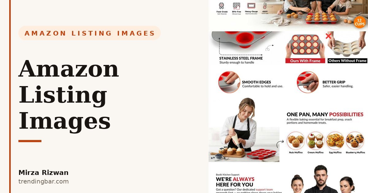
I'll be blunt: pretty doesn't sell on Amazon. Specific sells. I've watched expensive, gorgeous image sets lose to uglier ones that just answered the buyer's questions faster. Across my years as a freelancer, as Senior Amazon Visual Strategist & Packaging Designer at Packifyme (200+ listing image sets), and as Senior Graphics Designer & Product Photographer at HBK Blankets (180+ SKUs), I stopped designing for compliments and started designing for clicks. Here is the whole philosophy.
One more thing before the framework: I don't do generic. If your product is genuinely undifferentiated, no image set will save it, and I'll tell you that in the audit instead of taking your money. With an 86% client retention rate across those 500+ projects, I can afford to be picky about who I work with.
What I actually do
I don't start with design. I start with reviews: yours, your competitors', and the one-star reviews in your category that explain why people return things. That reading gives me an objection map: the three to five doubts sitting in a buyer's head before they click buy. Every module after that serves the map.
Tools matter less than the order of operations, but since sellers always ask: I work in Photoshop and Illustrator, and I mine reviews with Helium 10, Jungle Scout, and Data Dive before I touch a canvas. Knowing which phrases buyers repeat tells me which claims deserve the biggest modules. The design is the easy part once the research is right.
Module one is the hero, and its only job is the click. Most sellers treat it as a product photo. I treat it as an ad. One clear product, one visual hierarchy, zero confusion at thumbnail size. If it can't win the click, nothing else on the page matters.
Module two kills the biggest doubt. Not your second-best feature. The biggest doubt. This pattern has held across every category I've worked: Home & Kitchen, Beauty, Supplements, Electronics, Apparel, Pet, Lifestyle. The buyer who scrolls past image two has one burning question, and if your second image doesn't answer it, you've lost them.
Then come the infographics, but not the kind you're picturing. I use diagrams for what photography can't show: hidden construction, exact sizes, what's in the box, how it works. My Packifyme years drilled this into me: specificity diagrams trust. "Fits a 9x5 pan" beats "large capacity" every single time.
Lifestyle shots come late, and they're the most misused module in the game. Common advice says lifestyle sells the dream. I disagree: lifestyle proves the claim. If your infographic says it fits a busy kitchen, the lifestyle shot better show a real busy kitchen, not a marble fantasy. Buyers smell stock from a mile away.
Finally A+ Content, which I treat as the gallery's continuation, not a separate brochure. The shopper who scrolls down to A+ already likes you; comparison charts and brand story close the last mile. I keep the visual language identical so the page reads as one argument, not two.
The mistakes I see most
I ran a 50-listing audit recently and 76% of main images had a clear visual weakness. Tech listings mostly failed on composition (cluttered, no hierarchy), while lifestyle brands broke the white-background rule itself. Same patterns, over and over. Here are the five I see most:
- Your hero shows the product, not the reason. Sellers cram props, angle collages, and lifestyle scenes into the main image. At thumbnail size it all turns to mush. Amazon's rule is plain: pure white background, product filling most of the frame, readable at 100 pixels. Everything else belongs in modules two through seven.
- Text designed for desktop, read on a phone. Most of your traffic is mobile, and infographics built with desktop-sized paragraphs become grey smears on a phone screen. I design every module at thumbnail size first and full size second. If the headline doesn't survive the shrink test, it doesn't ship.
- Features listed, benefits missing. "304 stainless steel" means nothing to a buyer; "no rust rings on your counter in year three" means something. Every spec needs translation into the buyer's life. I learned this the hard way early in my career, shipping beautiful decks that said absolutely nothing.
- Copying the category leader's image order. Sellers screenshot the bestseller's gallery and mirror it module for module. But the leader's objection map isn't yours. Their doubt number one might be your biggest strength. Build your sequence from your own reviews, not their layout.
- Treating A+ as a brochure. Brands hand A+ to a different designer, or worse, reuse the gallery images at bigger sizes. The result reads like two different products. One visual language across gallery and A+, or don't bother.
None of these are taste problems. They are all information problems: the buyer needed an answer and the image gave them decoration instead. Fix the information and the design almost takes care of itself.
Where to start
If you want the tactical version with module-by-module specs, mobile sizing rules, and the exact order I use, I wrote it all down in my 2026 guide to designing Amazon listing images that convert. It's the checklist version of everything above.
And if you'd rather watch the thinking applied to a real product, my teardown of a silicone loaf pan listing walks through every decision, module by module, including the ones I got wrong the first time.
For proof instead of promises, browse my portfolio, with real case studies from the Boxiki family of brands and others, all built from actual client work, never mockups. And my services page spells out exactly what a listing image project includes, so you know what you're buying before we talk.
Everything above is free to steal and use yourself. But if you'd rather have a second pair of eyes, send me your ASIN for a free audit, and I'll tell you which module is losing you the click.