Teardown: What Top Baking Sheet Listings Get Right

Oct 6, 2026 · 10 min read
I've spent 8 years designing Amazon listing images, and kitchen is the category I keep coming back to. Not because pans are sexy. They aren't. I keep coming back because kitchen listings are brutally honest. If the size is unclear, you get returns. If the thickness looks flimsy, you get skipped. There's nowhere to hide behind pretty branding when the product is a flat rectangle of metal.
So I pulled apart a batch of top-ranked baking sheet listings and compared them with the cheap sets sitting on page three. I wasn't looking for who had the nicest photos. I was looking for patterns. What do the winners repeat, image after image, that the losers skip?
Six things. Every single time.
The pattern: winners answer questions, losers show product
Winners treat the image stack like a salesperson who only gets seven sentences. Losers treat it like a photo album.
That's the whole difference, and it lines up with what I found in my 50-listing Amazon image audit, where 38 of 50 main images (76%) had a clear visual weakness you could spot in under three seconds. Baking sheets fail in predictable ways: no scale, no thickness proof, no answer on warping. The top listings fix all three before you even scroll.
If you want the full framework behind this, my guide to designing listing images that convert lays out the slot system. Here it is applied to one very flat, very unforgiving product.
Image 1: the white-background trap most sellers fall into
Your main image has to show the exact set, at a large scale, on pure white. That's not opinion. Amazon's own image requirements say the main image must sit on a pure white background (RGB 255, 255, 255), the product should fill at least 85% of the frame, and the file should be at least 1,000 pixels on the longest side so zoom works. Source: Amazon Seller Central product image requirements.
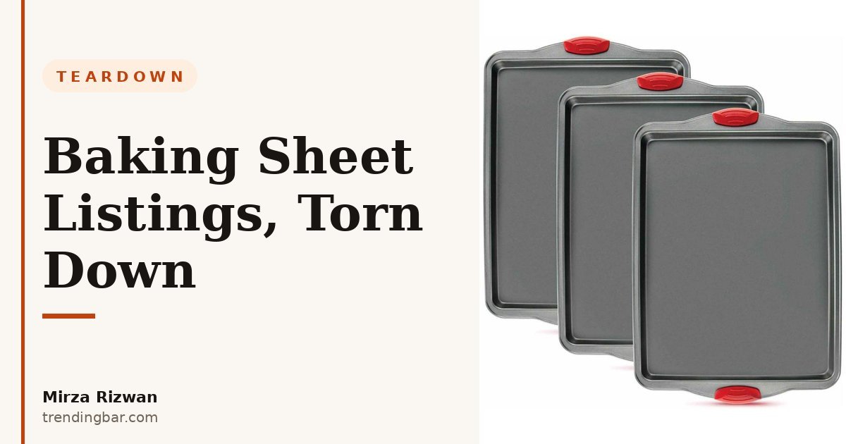
Top listings obey that and then do one smart extra thing: they stack the sheets at a slight angle so you can count them. Two sheets fanned. Three sheets stepped. You know in half a second how many pans you're getting.
Cheap listings? One sheet, shot straight down, floating in a sea of white. Is it a one-pack? A two-pack? You have to read the title to find out, and on mobile most people just won't. I've seen this mistake for years and it still surprises me. The pack count is the first buying question. Answer it in the photo, not in 12-point text.
A quick test I give clients: cover the title, look at image 1 for two seconds, then say out loud what's in the box. If you can't, the image fails. Rewrite it. (Yes, I actually make people do this. It works because it's uncomfortable.)
Images 2 and 3: proof beats adjectives, every time
Image 2 on every strong baking sheet listing is size proof. Image 3 is build proof. That order isn't random.
Size first because fit is a yes-or-no gate. The winners put the sheet inside an oven, next to a standard rack, or beside a hand with the dimensions written large: 17.9 x 13 inches, or whatever the real number is. No tiny spec table in the corner. Big, readable, mobile-first.
Then build. This is where weak listings write "heavy gauge" and "warp resistant" and think they've done something. They haven't. Top listings show the rolled edge in close-up, call out the actual gauge or thickness in millimetres, and show the underside. One listing I studied (I won't name brands here, the pattern is what matters) zoomed right into the rim so you could see it was a proper rolled steel edge, not a folded lip pretending to be one.
Why does this matter so much for pans specifically? Warping is the number one complaint in this category. Everyone who's owned a cheap sheet has heard that bang in a hot oven. Shoppers know it. They're hunting for proof it won't happen to this one. A close-up of a thick rim answers that fear better than a paragraph of copy ever will.
This is exactly the shift I talk about in my Amazon listing images hub: stop describing the product and start proving the claim. The word "durable" sells nothing. A 1mm thickness callout next to a real edge photo sells the pan.
The 7-slot stack that keeps showing up on winners
Here's the order I kept seeing, almost slot for slot. Steal it.
| Slot | Winner version | Cheap version |
|---|---|---|
| 1. Main | Full set fanned on white, pack count obvious | Single sheet, flat, pack count unclear |
| 2. Size | Sheet in oven or beside hand, dimensions large | Spec chart with tiny text |
| 3. Build | Rolled-edge close-up, thickness in mm | "Heavy duty" text over same hero shot |
| 4. Surface proof | Baked-on food sliding or washing off | Stock-looking cookies, no proof |
| 5. In use | Real bake: veg, cookies, one-pan meal | Same lifestyle shot as everyone else |
| 6. What's in the box | Flat lay, each piece named with size | Missing entirely |
| 7. Limits and care | Max oven temp, dishwasher note, stack storage | Warranty badge and nothing else |
Look at slot 6 for a second. A flat lay that names each piece sounds boring. It converts anyway. Sets get returned when buyers expect a quarter sheet and get something else, or think a rack is included when it isn't. The flat lay kills that confusion before checkout. Boring and profitable beats pretty and returned.
And slot 4 deserves honesty: a nonstick claim with no proof is just a claim. The winners show the moment of truth, an egg or cheese or roasted veg releasing from the surface. If your coating can't do that on camera, that's a product problem, not a design problem. I can't design my way out of a pan that sticks. Nobody can.
A+ Content: where winners win the comparison
A+ Content is not a bigger version of your images. The top listings use it to handle the one thing images do badly: side-by-side comparison.
Amazon itself says well-built A+ Content "can increase sales by up to 5.6%" - that's from Amazon Ads on A+ Content. I believe that number for a simple reason: comparison modules answer the last question, which is "why this set and not the cheaper one under it?"
One Amazon guide puts it plainly (and I'm paraphrasing their help docs here because the idea matters more than the wording): customers use images and A+ modules to evaluate a product when they can't pick it up. That's the job. You're replacing the in-store moment where someone picks up two pans and feels which one is heavier.
The A+ pattern that works in this category:
- A comparison table against a generic cheap sheet: thickness, edge type, oven limit, pieces. No competitor brand names needed, and I never use them.
- A materials strip: what the sheet is made of, what the coating is, what it is not. Specifics, not slogans.
- A size family graphic if you sell more than one sheet size, with a link path to the others.
What doesn't work? A lifestyle banner, a logo, and the headline "Premium Quality Baking" stretched across the top. I see that constantly. It says nothing, proves nothing, and wastes the best real estate on the page. If your A+ could be swapped onto any kitchen product without changing a word, it's furniture, not sales copy.
If you're deciding where A+ fits in your budget, I broke down the module choices in the A+ Content start-here guide on trendingbar.com. The short version for pans: comparison first, materials second, lifestyle last.
The 3 mistakes I would fix first on any cheap listing
If you gave me a struggling baking sheet listing and 90 minutes, I'd fix these three things before touching anything else.
One: the invisible pack. If I can't count the sheets in image 1, we reshoot image 1. Fan them, stack them, angle them. This is a 10-minute fix that I've watched change click behaviour because the thumbnail finally communicates value in search results, where you're one rectangle among forty.
Two: adjectives with no evidence. "Warp-proof. Heavy gauge. Commercial grade." Show me. Rim close-up, thickness number, oven temp limit printed on the image. Amazon shoppers have been burned by every adjective in the dictionary. They trust photos and numbers. Give them photos and numbers.
Three: no human scale anywhere. A baking sheet alone on white could be 9 inches or 20. Hands, ovens, standard racks, a familiar cookie for scale (okay, that last one is half a joke, but people genuinely judge size against food they know). Pick one reference and use it in image 2. Returns drop when size stops being a surprise. I've seen sellers learn this the expensive way, through a month of "smaller than expected" reviews that never really wash out.
Notice none of these need a rebrand, a reshoot of the whole set, or a new logo. They're order and proof problems. That's good news. Order and proof are cheap to fix.
What to copy first if your listing looks like the cheap column
Don't rebuild everything this week. Do it in this order, because this is the order shoppers decide in.
- Fix image 1 so the pack count reads in two seconds.
- Replace image 2 with a size proof shot in a real oven, dimensions large enough to read on a phone.
- Shoot one honest close-up of your rim or edge and put the real thickness on it.
- Add the flat lay. Name every piece. If a rack or liner isn't included, that flat lay is where you prevent the angry review.
- Only then rebuild A+ around one comparison table.
I say this as Mirza Rizwan, the designer behind trendingbar.com, and I'll say the unpopular part out loud: most baking sheet listings don't have a traffic problem, they have a proof problem. The clicks are there. The shopper lands, can't answer fit and warp and stick in 15 seconds, and leaves for a listing that can. Design is how you answer faster.
And no, you don't need seven lifestyle photos or a video of someone smiling at cookies. You need seven answers. There's a difference, and the top listings in this category understand it cold.
Selling kitchen products and not sure which of these your listing is guilty of? That's exactly what my free audit is for. Send me your listing through the contact page and I'll mark up your image stack slot by slot, the same way I did here, within 48 hours. No pitch deck. Just the fixes, in order.