Teardown: Manual Pull Chopper Listings — What Converts

Oct 10, 2026 · 10 min read
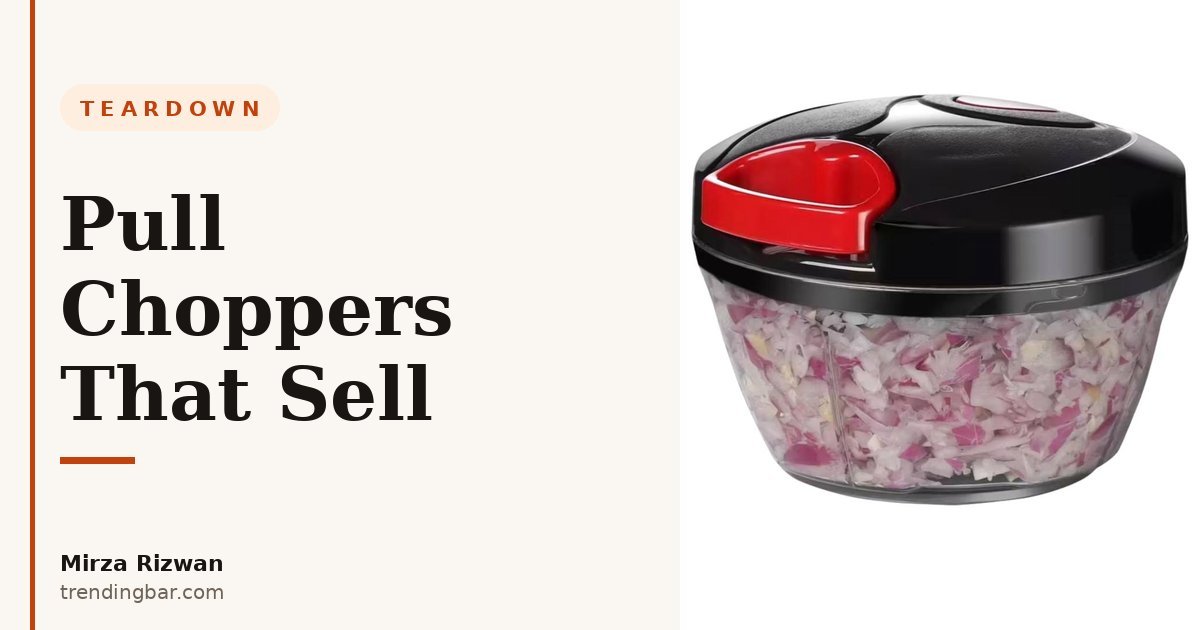
I'm Mirza Rizwan. I've spent 8 years designing Amazon listing images, and kitchen gadgets are where I see the same mistake repeat itself. A pull chopper is simple. You put food in, you pull the cord, it chops. That simplicity makes sellers lazy with images. They shoot the closed bowl on white, add a messy feature dump, and wonder why clicks don't turn into orders.
I looked through public listings in this category the way a shopper would, on my phone, scrolling fast. What I found wasn't surprising. The winners make the action obvious in seconds. The rest make you work to understand size, effort, and mess. Shoppers don't work. They go back to search.
Why do manual pull chopper listings struggle to convert?
They struggle because the main job of the product is invisible in a still photo. You can't hear the blades, you can't feel the pull resistance, and you can't tell if that bowl holds one onion or three. If the gallery doesn't translate motion and capacity into something visual, the shopper has to guess. Guessing kills conversion.
Amazon puts it bluntly in its seller guidance: "Product photos can make or break a sale." That's from Amazon's product photos and video guide, and it's exactly right for this category. The same guide explains that clear images help customers evaluate a product and keep expectations accurate, which also helps with returns.
I've seen this pattern in audits again and again. A listing I worked on had decent traffic but a weak gallery. The main image was clean, sure, but Image 2 tried to say everything at once. Twelve little callouts around a bowl. On desktop you could squint through it. On mobile it was noise. We stripped it to one job per image and the whole set finally made sense at thumbnail size. That's the lesson I keep coming back to, and it's the same one I wrote about in why cramming Image 2 hurts you.
What does a converting gallery look like for a pull chopper?
A converting pull chopper gallery follows a job-per-slot order: prove it works, prove it holds enough, prove it's not a pain to clean. Amazon recommends at least six images per product, and that advice shows up right in its FAQ on the product photos guide where it says every product should have at least one image and at least six are recommended. For this category I'd use all six plus a short video if you can.
Here's the order I'd run. It's not fancy. It's just honest about what a shopper is asking at each click.
| Slot | One clear job | What to show |
|---|---|---|
| 1. Main | Win the click | Closed chopper on pure white, product filling the frame, lid and handle readable at thumbnail size |
| 2. Action | Show the pull | Hand pulling the cord, food visibly chopped inside, one short benefit line only |
| 3. Result | Prove the outcome | Coarse vs fine chop side by side, no extra props competing for attention |
| 4. Capacity | Make size feel real | Bowl next to common vegetables, with a simple volume marker shoppers understand |
| 5. Detail | Build trust | Close-up of blades and lid lock, one callout per detail, large type |
| 6. Cleanup | Remove the last objection | Parts separated for rinsing, clear note on what can go in the dishwasher if true |
| 7. Video | Show effort honestly | 30 to 45 seconds, real pulls, real sound, no sped-up tricks |
That structure lines up with the slot map I use for most kitchen tools, which I broke down in how many listing images you actually need. The number matters less than the job each image is doing. Six random angles won't save you. Six clear answers will.
For the main image specifically, don't get cute. Amazon's requirements are strict for a reason. Your product needs to sit on a pure white background and fill at least 85% of the frame. I run through that checklist every time, and I keep a plain-English version in the main image compliance checklist so nothing gets suppressed over a silly technical miss.
What's the biggest mistake I see on Images 2 and 3?
The biggest mistake is hiding the action and stacking too many claims in one frame. Image 2 should answer one question: does this thing actually chop without electricity or a big machine? If I have to read six badges to get that answer, you've already lost me on mobile.
I learned this the hard way early on. I used to think more information per image meant more value. It doesn't. It means smaller type, weaker hierarchy, and a shopper who can't remember a single benefit after scrolling. Keep Image 2 to the pull and the result. Keep Image 3 to texture control. Can I get a rough dice for salsa and a finer chop for garlic in the same tool? Show that, plainly, with two bowls or two piles and clear labels. Don't write a paragraph on the image. The image is the paragraph.
There's a technical reason to keep these images clean and large too. Amazon says it prefers images larger than 1,000 pixels on the longest side to allow zoom, which it notes can enhance sales, from that same product photos guide. Zoom is how a shopper checks blade shape and bowl plastic. If your file is small or your callouts are cluttered, zoom just makes the mess bigger.
How should you show size, capacity, and cleanup without lying?
Show size with food, not just numbers. A capacity line like a litre measurement means almost nothing until I see that bowl next to an onion, a tomato, and a pepper. Put the vegetables beside the bowl at the same scale, keep the lighting honest, and add one simple marker. That's it. No hands that make the bowl look huge, no wide-angle tricks.
Cleanup is the question sellers avoid, and it's the one that drives returns and bad reviews. Is the blade unit separate? Does the lid need hand washing because of the pull mechanism? Say it in the image, clearly, in large type. I'd rather lose a sale up front than get the product back with a one-star note about mould in the lid. I've seen sellers bury this because they think honesty will hurt. It does the opposite. It filters in the right buyer.
This is where lifestyle context helps, but only if it stays truthful. A chopper on a real counter, with real chopped food next to it, tells a shopper this belongs in a weekday routine. That's very different from a styled scene with props that aren't included. Amazon warns against overpowering accessories for a reason, and I agree with that completely. Product first, context second. If you're building a full set, my framework in the listing images that convert guide walks through how I sequence lifestyle shots so they support the sale instead of confusing it.
Does a short video or A+ Content actually help a simple gadget?
Yes, if it answers the effort question honestly. A pull chopper lives or dies on whether a shopper believes the pull is easy. A 30-second video with real pulls, at real speed, does more than five extra feature bullets. Show a full onion going from chunks to chopped. Don't speed it up 3x and pretend it's effortless. People can tell, and trust drops fast.
Below the gallery, A+ Content can carry the parts that don't fit in six images, like a simple comparison of chop textures or a clear care diagram. Amazon states on its A+ Content page that Basic A+ can increase sales by up to 8% and well-implemented Premium A+ can increase sales by up to 20%, based on Amazon internal data. I don't treat those as promises for every listing, but they tell you Amazon sees real lift when brands explain a product properly instead of leaving it to a title and bullets.
My take is simple. For a low-price kitchen tool, don't spend your A+ modules on brand fluff. Spend them on the objections: capacity, cleanup, blade safety, and what it won't do well. A pull chopper isn't a food processor. Saying that clearly, with a comparison table, saves you returns and builds the kind of trust that gets a second purchase. That's the approach I outline in my hub guide to Amazon listing images, where I start every project from the shopper's questions, not the seller's feature list.
What would I fix first if a pull chopper listing came to me today?
I'd fix the order before I'd reshoot a single photo. Most listings in this category already have usable raw photos buried in the wrong sequence. Move the action shot to Image 2, move the result comparison to Image 3, pull capacity out of the bullet points and make it a proper visual at Image 4. That reordering alone usually makes the gallery feel like a different product.
Then I'd do three quick passes:
- Thumbnail test: shrink every image to search-result size and check if you can still read the one thing it's meant to say.
- One-job audit: write the job of each slot on a sticky note. If two images have the same job, merge them or cut one.
- Honesty check: read every claim on the images and ask if the photo actually proves it. If not, soften the claim or shoot the proof.
I'm Mirza Rizwan, and this is the work I do at trendingbar.com. I don't believe a simple product needs complicated design. It needs clear design. A pull chopper doesn't need twelve badges and a lifestyle scene with lemons that aren't in the box. It needs to show the pull, show the result, show the size honestly, and show that cleanup won't ruin your evening.
If you're selling a kitchen gadget and your gallery feels busy but still isn't converting, that's usually a sequencing problem, not a photography budget problem. Start with the order in the table above, keep one job per image, and make the action impossible to miss.
Get a free listing audit and I'll tell you exactly which three fixes I'd make first on your gallery, within 48 hours. No pitch, just the same checklist I run on my own work. You can also see more of how I work across recent projects and the services I offer.