Packaging Is a Billboard, Not a Brochure

Oct 23, 2026 · 9 min read
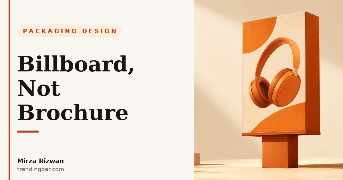
I've been designing packaging for eight years now, mostly for US and UK brands selling on Amazon and in retail, and I keep running into the same argument. A founder sends me a dieline with fourteen claims on the front panel, and when I suggest cutting eleven of them, they look at me like I just insulted their product. "But all of this is important," they say. And they're right. All of it IS important. It's just not important here.
This is my opinion, and I'll say it plainly: most brands treat their packaging like a brochure, and it's costing them sales. The front of the box is not where you make your case. It's where you earn the right to make your case somewhere else.
What "billboard, not brochure" actually means
A billboard works at 60 miles an hour. A brochure works in someone's hands, over coffee. Your front panel is the billboard. Your back and side panels are the brochure. That's the whole idea, and everything in packaging design flows from which panel you're designing for.
Think about how a shopper actually meets your product. In a store, they're walking down an aisle with a hundred boxes competing for their eyes. Online, they're scrolling a grid of thumbnails. In both cases, your front panel gets a glance, not a reading session. Nobody actually reads your packaging the way you hope they will. What they do is scan it, and scanning is a ruthless editor. It keeps the biggest, clearest thing and throws the rest away.
So the question isn't "what should the front panel say?" It's "what should the front panel say in three seconds, from three feet away?" If the answer is more than one idea, you're writing a brochure on a billboard. And brochures on billboards don't work, because nobody slows down to read them.
The brochure instinct is strong. It's also wrong.
Here's the thing: the brochure instinct comes from a good place. Founders cram the front panel because they're scared. Scared the buyer won't turn the box around. Scared one missing claim will lose the sale. I've sat in reviews where a client defended eight bullet points on the front with "but what if they don't read the back?" And I get it. When it's your product, every feature feels essential.
But the data says the fear is misplaced. In a Paper and Packaging Board study, 72% of American consumers said packaging design can influence their purchasing decisions. Read that carefully. It doesn't say packaging information influences decisions. It says packaging design. The visual impression. The instant read. Shoppers decide how they feel about your box before they've processed a single sentence on it.
I learned this the hard way on an early project. A client wanted every certification, every ingredient highlight, every award on the front of their box. We shipped exactly what they asked for. Then we did a simple test: we showed the box to strangers for three seconds and asked what they remembered. You know what they said? "It looked busy." That's it. Not one claim survived. All that information, and the only thing it communicated was clutter.
The 3-second test I run on every front panel
The 3-second test is brutally simple. Hold your front panel at arm's length, or shrink a photo of it to thumbnail size. Glance for three seconds. Then answer: what is this product, who's it for, and why should I care? If you can't answer all three, the panel fails. Redesign it.
As Rishab Jain, founder of Confetti Design, put it: "In those critical three seconds on a shelf, your design either whispers forgettable or shouts unforgettable. That moment of connection is why packaging isn't the final step in product development, it's the first step in customer loyalty." He's right, and I'd push it one step further. Those three seconds don't just decide whether they notice you. They decide whether they trust you. A clean, confident front panel reads as a brand that knows what it's selling. A crowded one reads as a brand that's hoping something sticks.
I run this test on my own packaging design work before anything goes to a client, and I'd say a third of first drafts fail it. Mine included. The instinct to add "just one more thing" never goes away. You have to design against it on purpose.
What actually goes on a billboard panel
So what survives the cut? A billboard panel needs exactly five things, and it should fight for its life to justify a sixth.
- The brand block: your logo, readable at distance. This is the one non-negotiable. Everything else serves it.
- The product name: big, plain, unmissable. Not a clever tagline. The actual thing inside the box.
- One hero visual: the product itself, shot or illustrated well. Not a lifestyle collage. Not five angles. One strong image.
- One differentiator: the single reason to pick this box over the one next to it. "Organic." "Extra strength." "Fits 15-inch laptops." Pick the strongest one and kill the rest.
- One trust cue: a rating, a certification mark, "1M+ sold." Something that says other people already trust this. One.
That's the whole billboard. Notice what's missing: the ingredient list, the usage instructions, the brand story, the QR code farm, the "as seen on" strip, the three paragraphs about your founder's journey. Those aren't bad things. They're just brochure things, and they go on the brochure panels.
| Billboard panel (front) | Brochure panels (back/sides) |
|---|---|
| One idea, readable at 3 feet | Full story, readable in hand |
| Product name + one hero visual | Feature lists, specs, comparisons |
| One differentiator | All the differentiators |
| One trust cue | Certifications, awards, reviews |
| Brand block, bold | Brand story, founder note, QR codes |
| Job: earn 30 more seconds | Job: close the sale |
There's a stat worth knowing here too: 40% of consumers say they associate premium packaging with product quality. And "premium" never means "more words." It means restraint. White space. Confidence. The brands that look expensive are the ones that said the least on the front. That's not a coincidence. It's the billboard working exactly as designed.
The brochure still matters. Just not on the front.
Let me be clear about something, because this opinion gets misread. I'm not saying delete your information. I'm saying relocate it. The back panel is where paragraphs live. The side panels are where the full feature list, the ingredients, the instructions, and the certifications go. That content does real work, but only after the billboard has earned the shopper's attention. Sequence beats density. Hook first, details second.
This is also where most of the design skill actually goes, honestly. The front panel is a discipline problem. The back panel is a craft problem: how do you lay out a wall of required information so it still feels like the same brand? Hierarchy, grids, breathing room. The buyers who pick up the box after the billboard hooked them will read this stuff carefully. Respect them with a layout that respects their time.
If you're staring at a dieline wondering whether it's time for a bigger change, I've written about the signs you need a packaging redesign. Usually the symptom is the same one this post is about: a front panel trying to do the back panel's job.
Why this matters even more on Amazon
Here's the part Amazon sellers miss. On Amazon, the buyer never touches your box before they buy. Your image stack IS your packaging. And the exact same split applies.
Your main image and the first two or three infographics are the billboard. One message per image, readable at thumbnail size, no paragraphs. I've written about the 3-second rule I use for Amazon main images, and it's the same principle wearing different clothes. Then images four through seven, and your A+ Content, are the brochure. That's where the comparisons, the details, the story go.
Sellers get this backwards all the time. They cram twelve features onto image two, which is the equivalent of writing a brochure on a billboard. Then their A+ Content repeats the same twelve features instead of doing the brochure's real job: answering the questions the billboard made the buyer curious about. Same disease, two organs.
My take, after eight years of this
If I could give every founder one packaging rule, it's this: the front panel is an ad, not a manual. Design it for the glance, not the study session. Cut until it hurts, then cut one more thing. The information you're scared to remove isn't lost. It's just waiting on the back panel, where the buyer you just hooked will actually read it.
I'm Mirza Rizwan, and I design packaging and Amazon creative at trendingbar.com. Every front panel I ship has to pass the 3-second test before a client ever sees it. Most don't, the first time. That's fine. The test exists because the instinct is universal, including mine. The difference between a billboard and a brochure isn't talent. It's the willingness to delete.
Think your front panel might be a brochure in disguise? I offer a free packaging audit — I'll tell you the three things your front panel should say, and everything that should move to the back, within 48 hours.