The 'Premium Look' Trap: Why Luxury Packaging Kills Budget Brands

Oct 11, 2026 · 8 min read
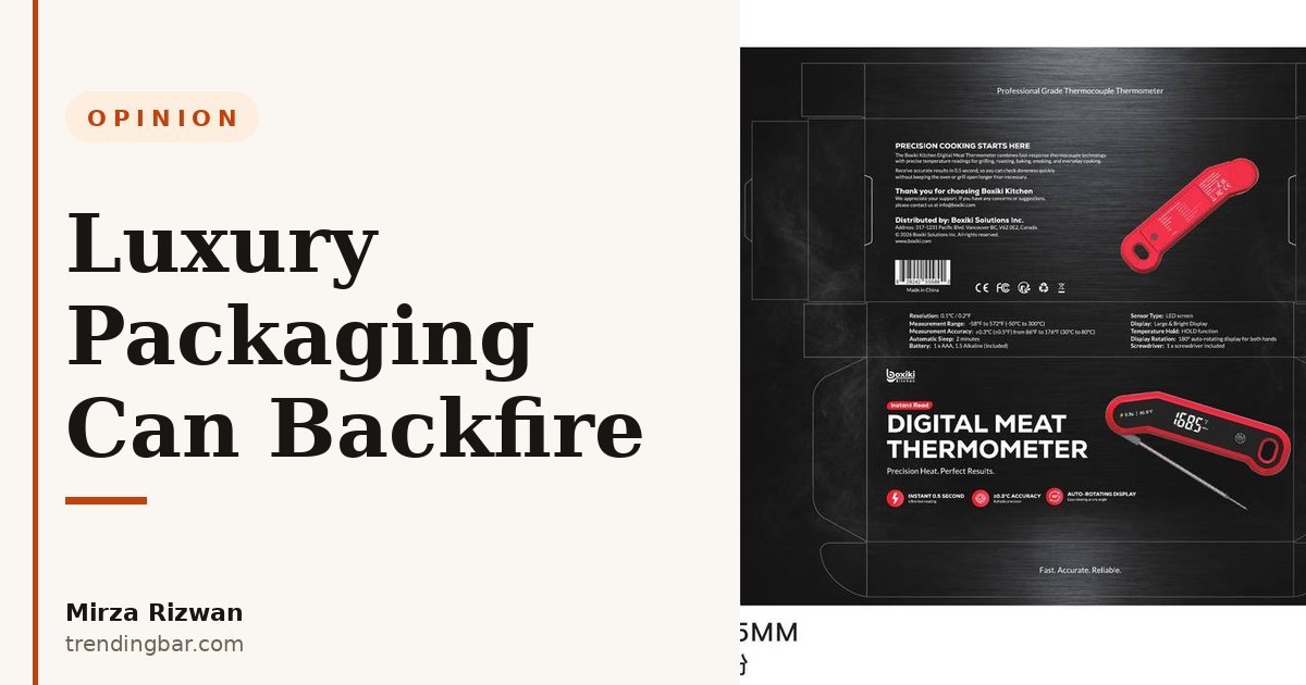
Every month, someone asks me the same question. "Shouldn't my packaging look premium?"
And I get it. You've seen the unboxing videos. The matte-black box, the foil-stamped logo, the lid that lifts with that satisfying little resistance. It looks like success. So you assume your product should look like that too.
I'm Mirza Rizwan. I design packaging and Amazon listing images for sellers at trendingbar.com, and I'm going to say the thing most designers won't: for a budget brand, the premium look is a trap. I've watched sellers spend their way into worse sales with boxes that were too nice for the product inside.
Why would nicer packaging ever hurt a budget brand?
Because buyers read packaging as a price signal. When the signal lies, trust breaks.
Think about it. You pick up a box that feels expensive: rigid board, soft-touch coating, the logo pressed in gold. Then you see the price: $18.99. What goes through your head?
Either "this is too good to be true" or "so what's wrong with it?" Suspicion, not delight. A budget kitchen brand I worked with made exactly this upgrade: they swapped a clean printed carton for a rigid foil-stamped box. Same product, same price. The reviews that mentioned packaging weren't thanking them. They were confused. The box promised something the product never claimed to be.
That's the trap. A $19 product in a $4 box doesn't look like a bargain. It looks like a lie. And on Amazon, where the buyer can't pick the product up and judge for themselves, confusion doesn't convert. Confusion bounces.
What does the "premium look" actually cost?
More than the invoice. It costs you the things that actually sell.
Here's the unit-economics reality nobody shows in the unboxing videos: every dollar you put into the box is a dollar you didn't put into the listing images or the ad budget. For a $19 product in a $4 box, you've just spent the money that should have bought you a proper lifestyle shoot and a week of PPC testing, spent on something the buyer only sees after they've already paid.
I've had this conversation more times than I can count. The seller has a budget. It's always smaller than they want. And the premium box always wins the budget fight, because it's tangible. You can hold it, your friends ooh at it, it feels like progress. Listing images are abstract until they're done. So the box gets the money, and the listing gets whatever's left. That's backwards. The listing is the storefront. The box is the bag the cashier hands you on the way out.
A simple rule I use: your packaging should cost a small fraction of your retail price, and the fraction shrinks as the price drops. If the box is eating the margin that funds the images and ads that bring the sale, the box is too expensive. Full stop.
Would you put a gumball in a wedding-ring box?
This is the mismatch test I run on every packaging brief. Picture it: a velvet ring box. You open it. There's a gumball inside. Funny? Sure. But what do you actually feel?
Disappointed. Maybe a little cheated. The box set an expectation and the contents couldn't meet it.
That's what a foil-stamped magnetic-closure box does to a budget product. The unboxing experience has to match the product tier. When it overshoots, the buyer doesn't think "wow, what value." They think "why did they try this hard?" And a buyer who's asking that question is already halfway to a return.
I learned this the hard way when a brand I advised went all-in on presentation for a basic household product. The unboxing footage looked great. The product was fine. But "fine" doesn't survive a premium unboxing. The gap between the box and the thing inside became the story. Nobody films a video about adequate packaging. They film the gap.
Match the promise. That's it. A $19 product in a clean, well-designed carton feels honest. Honest converts.
When do premium finishes actually make sense?
Plenty of times. Just not as a default. There are three situations where I'd argue for the foil and the magnet.
First, the price supports it. Once you're at $60 and up, the buyer expects the box to feel like $60. A premium price in a flimsy mailer creates the same mismatch, in reverse. The ladder works both directions.
Second, gifting. If your product is bought as a gift, the box is part of the product. You can tell from the reviews — gift purchases leave a trail. Nobody wants to hand over a crushed-looking carton at a birthday. Here, presentation is the value.
Third, subscription or repeat purchase. When the box shows up monthly, it's a brand touchpoint that earns its keep over time. The per-box cost spreads across a customer relationship, not a single sale.
Notice what's missing from that list: "because it looks cool in a mockup." If you're choosing someone to design any of this, read my guide on how to pick a packaging designer who understands Amazon sellers before you sign anything.
The 3-tier packaging ladder
So where should your brand sit? Here's the ladder I sketch for every client. Find your price, find your tier, and stop climbing past it.
| Tier | Price band | Packaging level | Where the budget goes instead |
|---|---|---|---|
| Tier 1 (Budget) | Under $25 | Clean printed carton, strong one-color design, good dielines | Listing images, A+ content, ad testing |
| Tier 2 (Mid-market) | $25–$60 | Upgraded carton, one premium accent (spot UV or foil on the logo), inside-flap messaging | Lifestyle photography, brand story modules |
| Tier 3 (Premium) | $60+ / gifting | Rigid box, magnetic closure, tissue, insert card | Unboxing is part of the product: spend here |
The mistake I see most is tier 1 brands buying tier 3 packaging. The second most common is tier 3 brands shipping in tier 1 mailers and wondering why their "luxury" positioning doesn't land. Both are the same error: the box and the price are telling different stories.
For the full system (structure, dielines, print specs), see the packaging design hub.
On Amazon, your box is a prop, not the product
Here's the part that makes this an Amazon problem, not just a packaging problem: the buyer never holds your box before they buy.
On Amazon, the listing images are the unboxing experience. The buyer "opens" your product by scrolling. That beautiful rigid box? It shows up as a prop in image four or five, or in a lifestyle shot in A+ content. It's set dressing. The product is the hero.
So ask yourself: is your box photogenic enough to earn one lifestyle shot, while staying cheap enough to protect your margin? That's the entire job of budget packaging on Amazon. A clean carton with a sharp logo photographs beautifully. I've shot gorgeous lifestyle scenes around plain kraft cartons. The camera doesn't know what the box cost. The buyer doesn't either. By the time it arrives, they've already bought.
This connects to something I wrote about before: nobody reads your packaging anyway, so design for the three-second scan, not the unboxing. The discipline is the same. Spend where the decision is made. For the images side of that equation, the Amazon listing images hub covers how I build image sets that carry the sale.
One more honest observation from eight years of this work: the sellers who obsess over their box are usually avoiding the harder question, which is whether their listing deserves the click. The box is comfortable. The listing is where the fight is.
So here's my rule, and I'll die on this hill: packaging should match the price promise, never exceed it. Take whatever you were about to spend on foil and magnets and put it into the images and ads that decide whether anyone ever sees the box. Your margin will thank you. Your conversion rate will too. And your buyer, holding a clean, honest box that matches the $19 they paid, will feel like they got exactly what they were promised. That's what trust looks like. It doesn't need foil.
Want a second pair of eyes on yours? I offer a free packaging audit. Send me your listing and your current box, and I'll tell you which tier you're actually in and where the budget is leaking.