What Printers Need From Your Packaging Files

Oct 29, 2026 · 8 min read
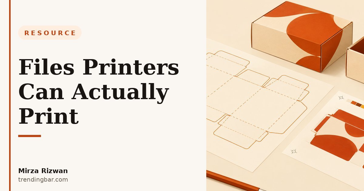
I have watched good packaging artwork turn into a slow, expensive print job for one reason: the file handed to the printer was a design file, not a print file. The artwork looked great on screen. It was not ready for a press. If you have ever paid for a reprint because a color shifted, a font swapped, or a fold landed on a headline, you know the pain. This post is the handoff checklist I wish every founder had before they emailed their printer.
Send a print-ready PDF, not your design file
The bottom line: your printer should receive a flattened, print-ready PDF, and your editable design file should stay with you as backup. A native design file invites font substitutions, moved layers, and version confusion. A PDF locks the layout in place.
Export the PDF with crop marks and bleed, in CMYK, at the printer's requested PDF standard (ask which one they use, PDF/X-1a and PDF/X-4 are the usual answers). Name the file clearly: brand, product, size, version, and date. "Final-FINAL-v7.pdf" is how the wrong version gets printed. I use names like BrandName-Box-100x60x40mm-v3-2026-10-29.pdf, and I keep a one-line changelog in the handoff email.
Before you export, flatten transparencies the way the printer asks, and check that no RGB images or spot colors are hiding in the file unless you planned them. One stray RGB image can shift an entire panel's color when it converts to CMYK on press.
The dieline is the contract between design and manufacturing
The bottom line: if the dieline is wrong, everything built on top of it is wrong, so confirm it before you design a single panel. The dieline is the flat template showing every cut, fold, and glue tab. Printers usually supply it, and you should never draw your own from scratch unless the printer asks you to.
Ask for the dieline in a vector format, place it on its own locked layer, and design around its fold lines and glue areas. Keep critical text and logos out of the fold zones and at least 3mm inside the safe area. I have seen beautiful front panels ruined because a headline sat exactly on a score line and cracked after folding. If you are still choosing a structure, my guide to folding carton vs rigid box options walks through the trade-offs before you commit to a dieline.
When the printer sends a revised dieline, treat it as a new version, not a tweak. Re-check every panel against it, because a moved fold line can shift your whole layout. For a plain-language explainer of how dielines work, read packaging dielines explained for founders.
Color: CMYK, spot colors, and why your screen lies to you
The bottom line: design in CMYK from the start, name any spot colors explicitly, and judge color from a physical proof, never from your monitor. Screens show RGB light. Printers lay down CMYK ink. That gap is where "the blue looks different" complaints are born.
For most folding cartons and labels, CMYK is the default. Add a Pantone spot color only when a brand color must match exactly across runs, and budget for it, because each spot color adds a plate and a cost. Tell the printer which colors are spot and which are process, in writing, in the handoff email. Do not rely on color names inside the file alone.
Ask for a hard proof on the actual stock when color accuracy matters, and check it in daylight, not under office fluorescents. Digital proofs are fine for layout checks. They are not reliable for final color approval. Packaging is worth this care: research cited by Ipsos found that 72% of consumers say packaging design influences their purchasing decisions, and a separate report found 81% of consumers bought a new product because of its packaging design. The box is doing selling work, so its color deserves a real proof.
Fonts, images, and resolution: the preflight checklist
The bottom line: outline or embed every font, use 300 dpi images at final size, and run a preflight check before you send anything. These three items cause more rejected files than any creative decision.
| Item | What the printer needs | Common mistake |
|---|---|---|
| Fonts | Outlined or fully embedded | Missing font replaced with a default |
| Images | 300 dpi at 100% of print size, CMYK | 72 dpi web image stretched to fill a panel |
| Bleed | 3mm (0.125 inch) beyond trim on all sides | Artwork stopping exactly at the trim line |
| Safe area | 3mm inside trim for text and logos | Headline touching the cut edge |
| Barcodes | Vector barcode with quiet zone, 100% black | Low-resolution barcode that will not scan |
| Black text | 100% K, not rich black, for small type | Rich black small text that registers blurry |
Barcodes deserve a special note. A barcode printed too small, stretched, or in a color other than black on white may fail at checkout, and that is a recall-level problem, not a cosmetic one. Keep the quiet zone clear and never place a barcode across a fold.
Materials, finishes, and quantity change the file
The bottom line: tell the printer your stock, finish, and quantity up front, because each one changes how the file must be built. A matte laminated carton, an uncoated kraft box, and a foil-stamped rigid box are three different print jobs, even with identical artwork.
Uncoated stock soaks up ink and dulls color, so art for kraft needs more contrast and bolder type than art for coated stock. Foil and embossing need separate vector layers or spot-color masks, clearly labeled, with no gradients or fine detail below the printer's minimum line weight. Ask for those minimums in writing: minimum foil line weight, minimum emboss depth, minimum type size for each finish.
Quantity matters too. Digital printing suits short runs and lets you test a design. Offset printing suits long runs and gives tighter color control. If you are unsure which route fits your budget, read real packaging design price ranges before you brief anyone, and remember that packaging is a selling surface, not a brochure: my post on why packaging works like a billboard explains how to prioritize what goes on it.
Approve the proof like it is the final product, because it is
The bottom line: check the proof against a printed checklist, sign it only when every panel is right, and keep a copy of exactly what you approved. The signed proof is what the printer is contractually printing.
My proof routine: read every word out loud (your eyes skip errors on the tenth read, your ears catch them), check the barcode with a scanner app, confirm the dieline matches the approved version, and check color against the hard proof, not the PDF on screen. Then I confirm quantity, stock, finish, and delivery address in the same approval email, so nothing lives only in a chat thread.
As David Ogilvy wrote in Confessions of an Advertising Man, "The consumer isn't a moron; she is your wife. You insult her intelligence if you assume that a mere slogan and a few vapid adjectives will persuade her to buy anything. She wants all the information you can give her." (David Ogilvy, via Wikiquote). Printers are the same: give them complete information and they will give you a clean run. Give them guesses and you will pay for the corrections.
The handoff email you can copy
The bottom line: one email with every spec, attached files, and a clear approval process beats five chat messages and a shared drive link. Here is the structure I use:
- Files attached: print-ready PDF, dieline confirmation, barcode file, spot-color list if any.
- Specs in the email body: stock, finish, quantity, box dimensions, print method if agreed.
- Proof requested: digital proof for layout, hard proof for color (state which you need).
- Approval process: who signs off, and by when.
- Delivery: address, deadline, and any split-shipment needs.
If your packaging still needs design work before it is ready for a printer, start with the packaging design hub for the full workflow, and watch for the warning signs in five signs you need a packaging redesign. A clean handoff starts with artwork built for print, not artwork rescued for print.
Want a second pair of eyes on your files before you send them? I offer a free audit and will flag the preflight issues that would cost you a reprint, before your printer finds them.